
STRIHA
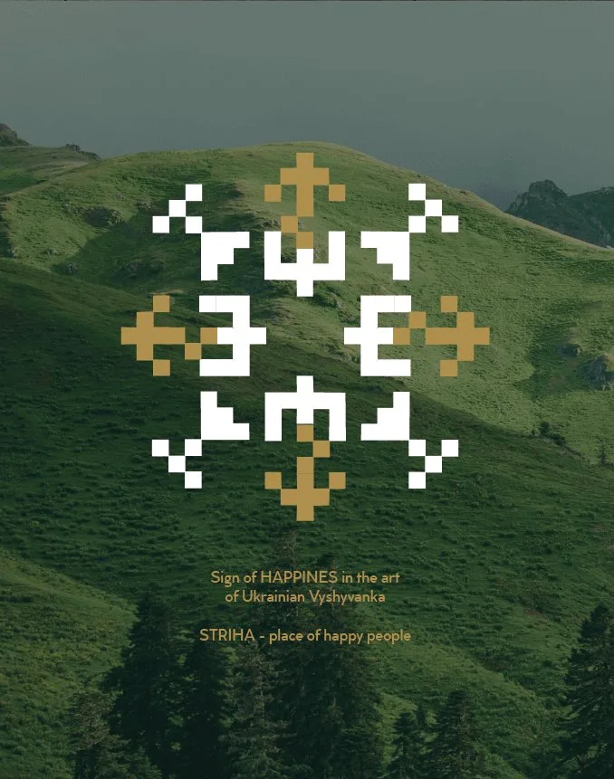
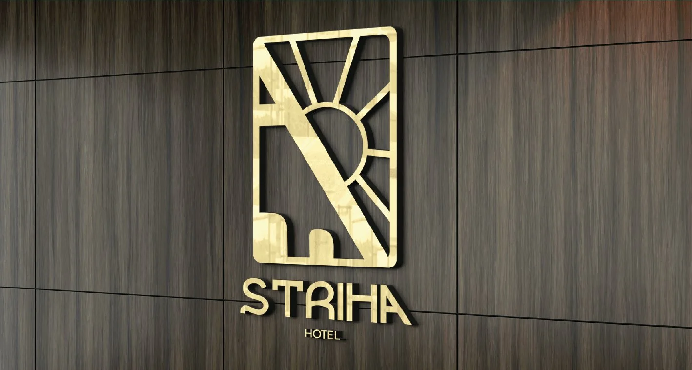
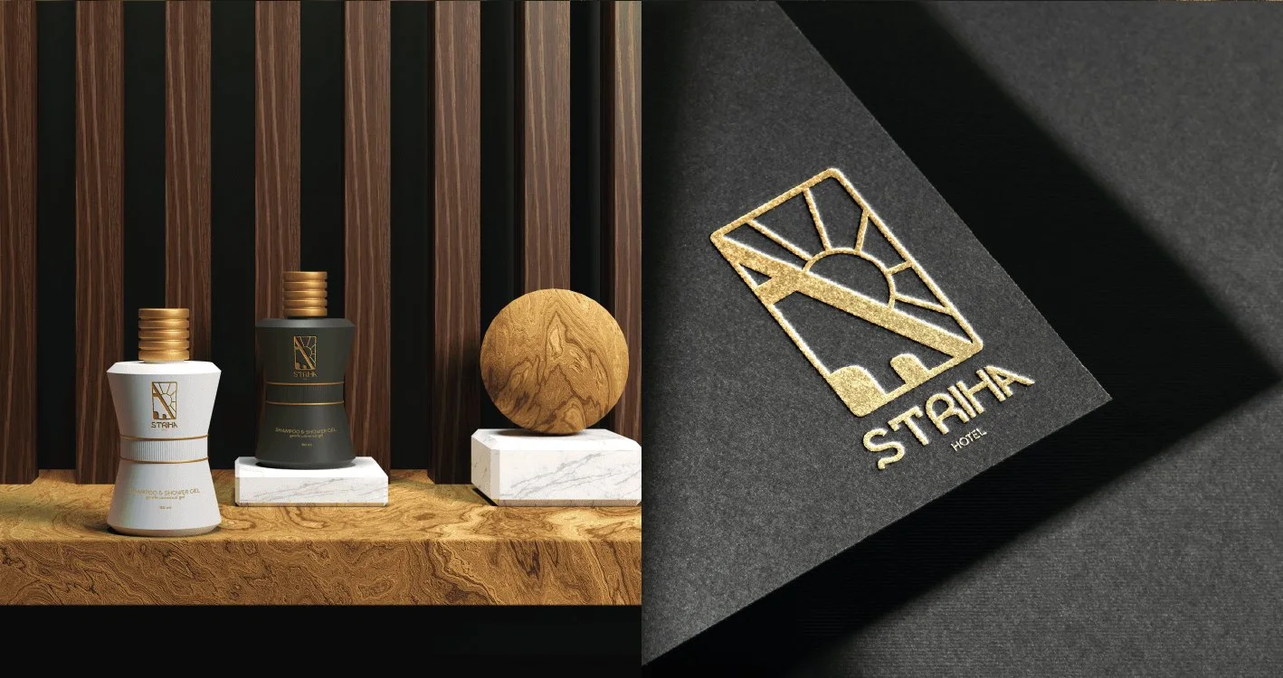
Brand identity for a hotel in the Ukrainian Carpathians: a gold mark with a rising sun, forest green and a pattern taken from Ukrainian vyshyvanka.
- Client
- Hotel STRIHA
- Industry
- Hotel
- Scope
- Logo · Pattern · Colour · Print · Signage
- Designer
- Sonya
- Year
- 2024
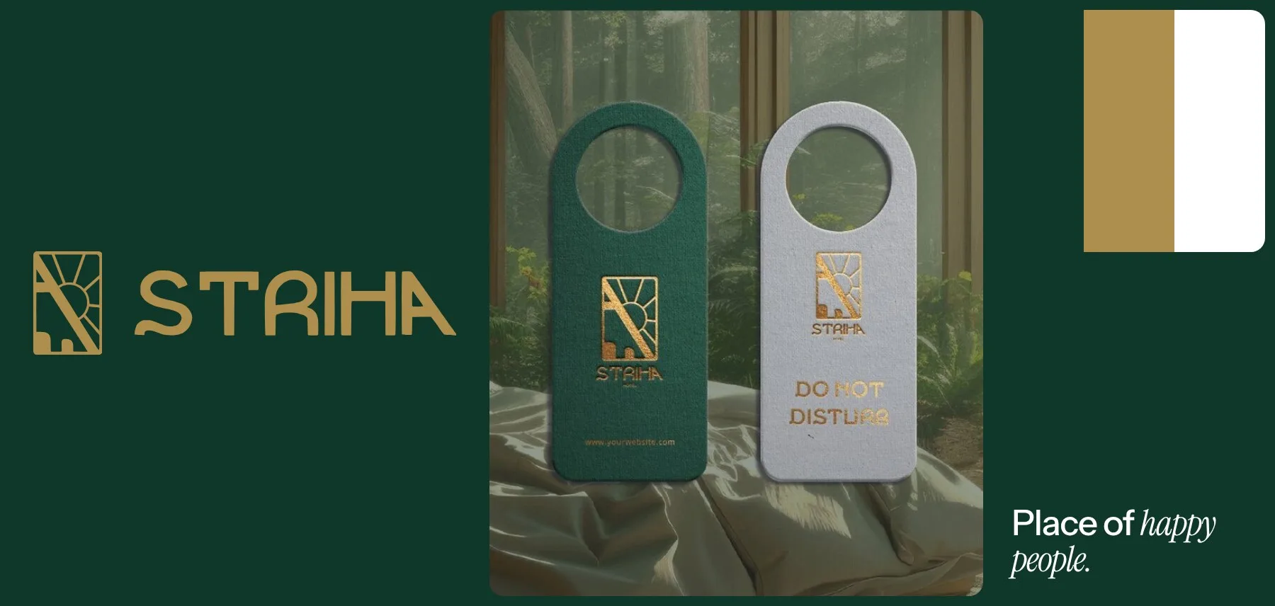
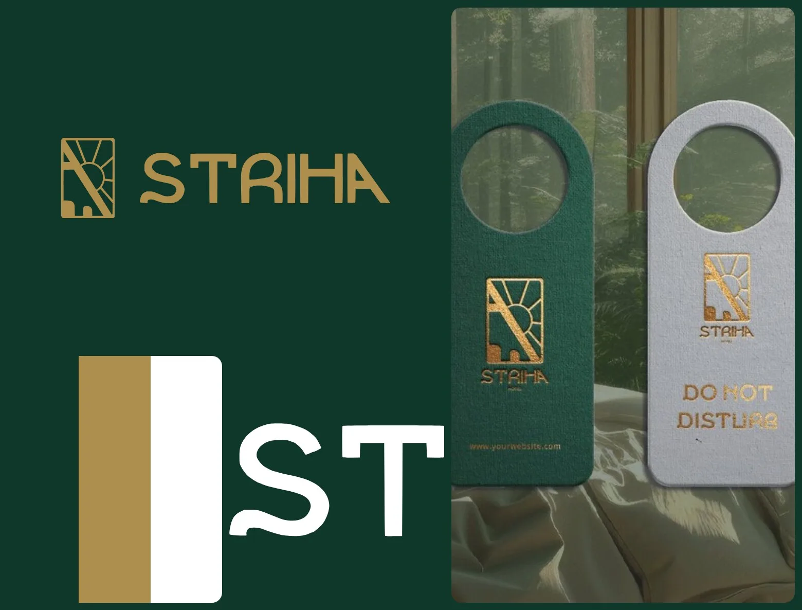
STRIHA — place of happy people.
A hotel in the Carpathian Mountains that blends traditional Ukrainian hospitality with modern comfort — and wants guests to feel it in everything from the booklet to the door hanger.
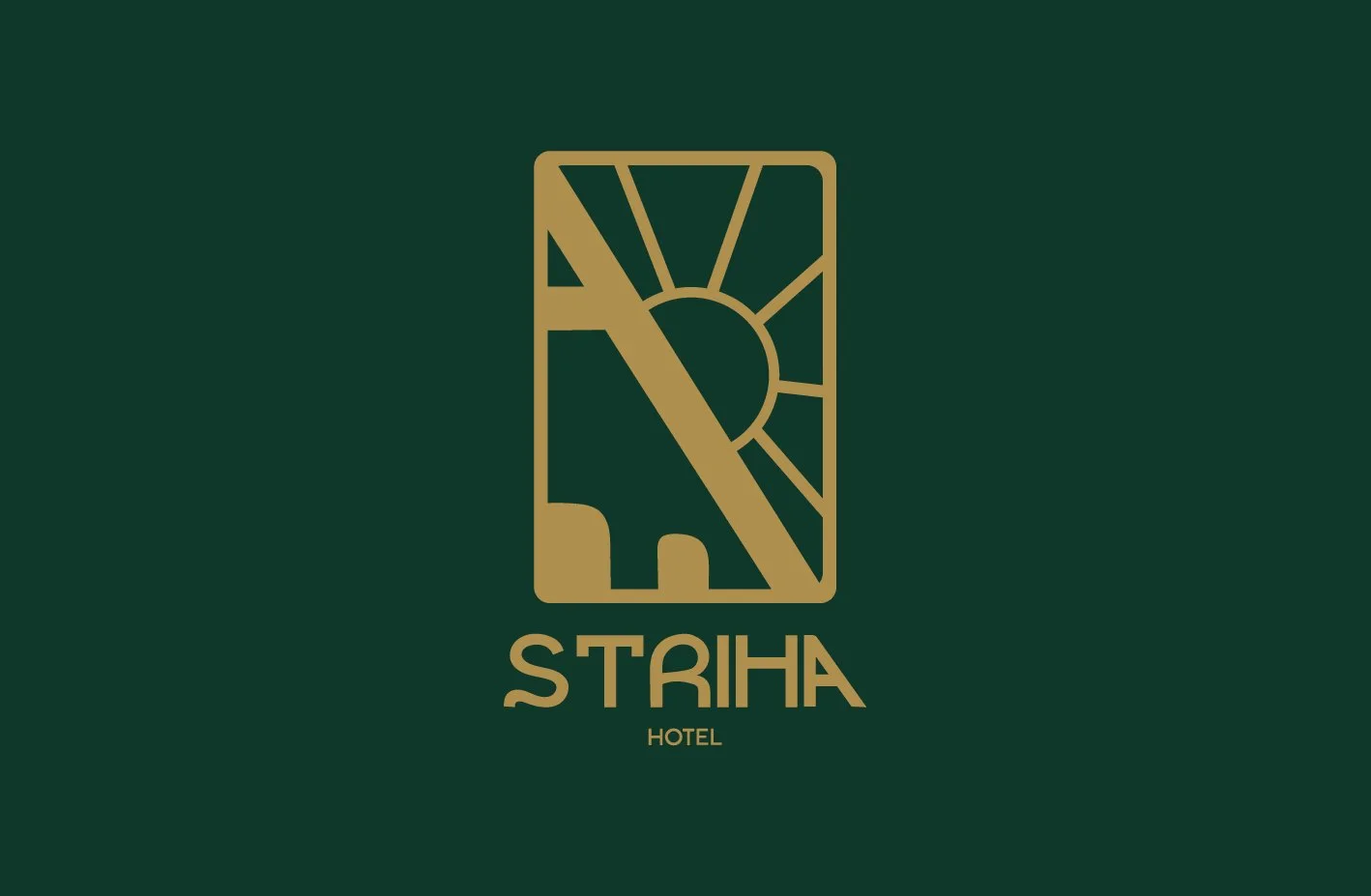
Sonya drew a mark in a gold frame: a rising sun cut by a diagonal, with small shapes along the bottom edge, and set STRIHA in rounded capitals under it. Forest green and gold, plus a pattern built from the sign of happiness in Ukrainian vyshyvanka, run across the booklet, business cards, a roadside sign, door hangers, the reception wall and amenity bottles.
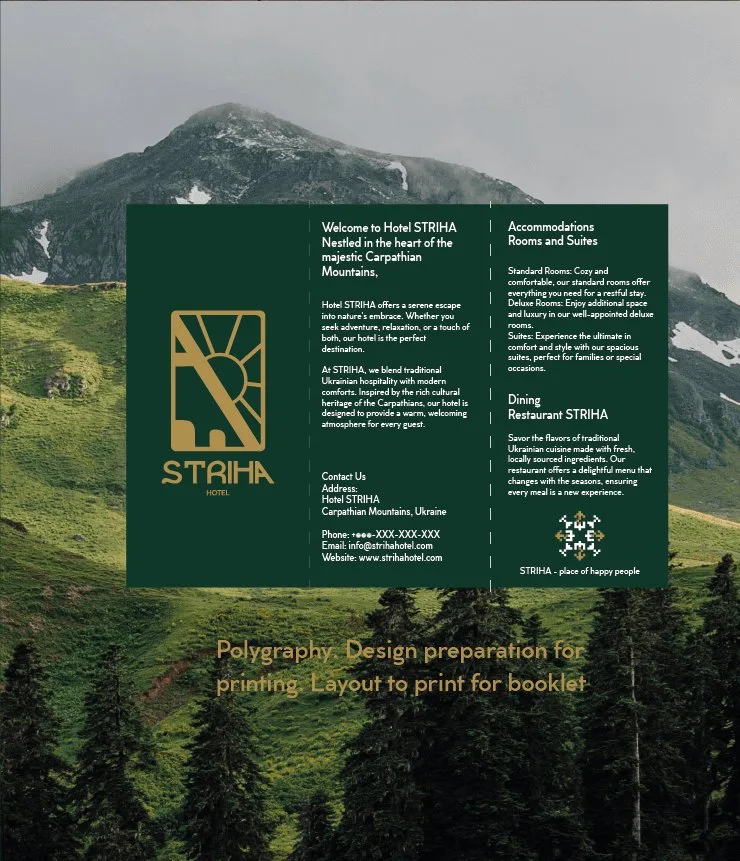
Forest and gold.
Deep forest green as the ground, gold for the mark, white for the text.
- Forest#0F382B
- Gold#AE8E4D
- White#FFFFFF
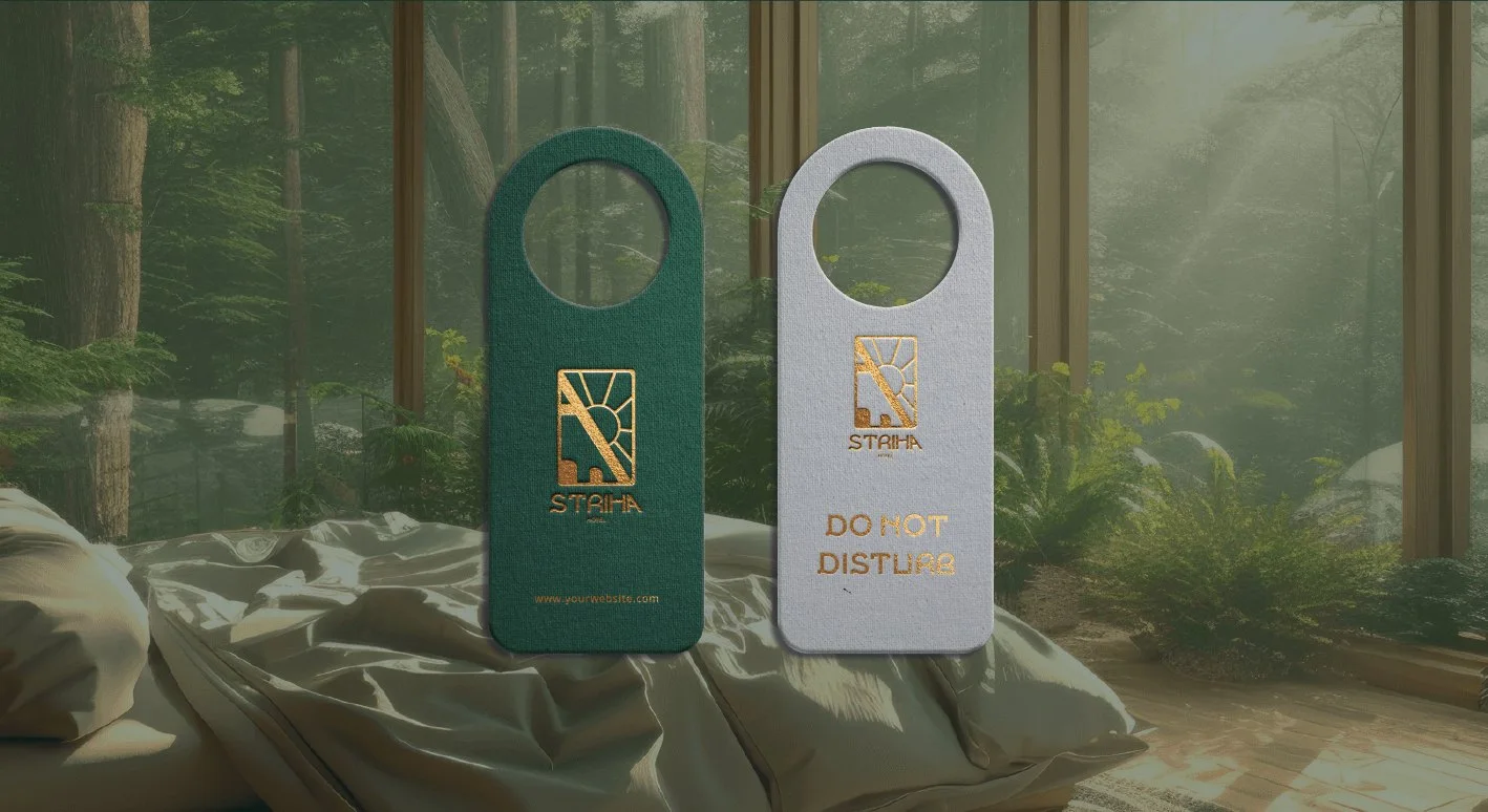
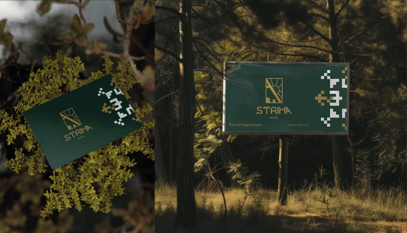
Placeof happypeople.
The line under the pattern in the booklet.
Astergrid

Let’s launch.
Send a short brief or a link to your current site. You’ll get a clear plan, timeline and quote — no sales call required.
- Reply within one business day
- Design, build and launch by one team
- One week of post-launch support included
Brief sent.
Thanks — we’ll read it and come back with a plan, a timeline and a quote.