
Astergrid
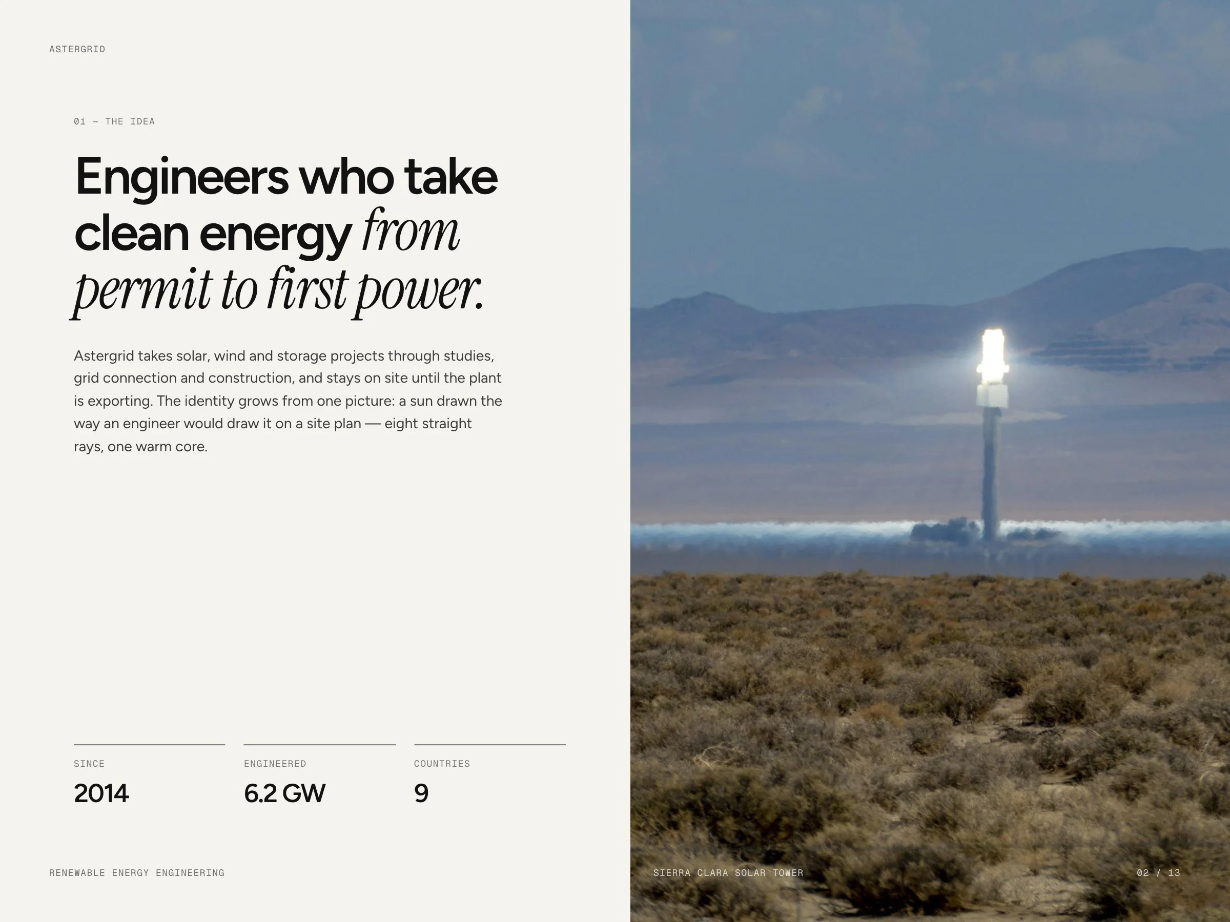
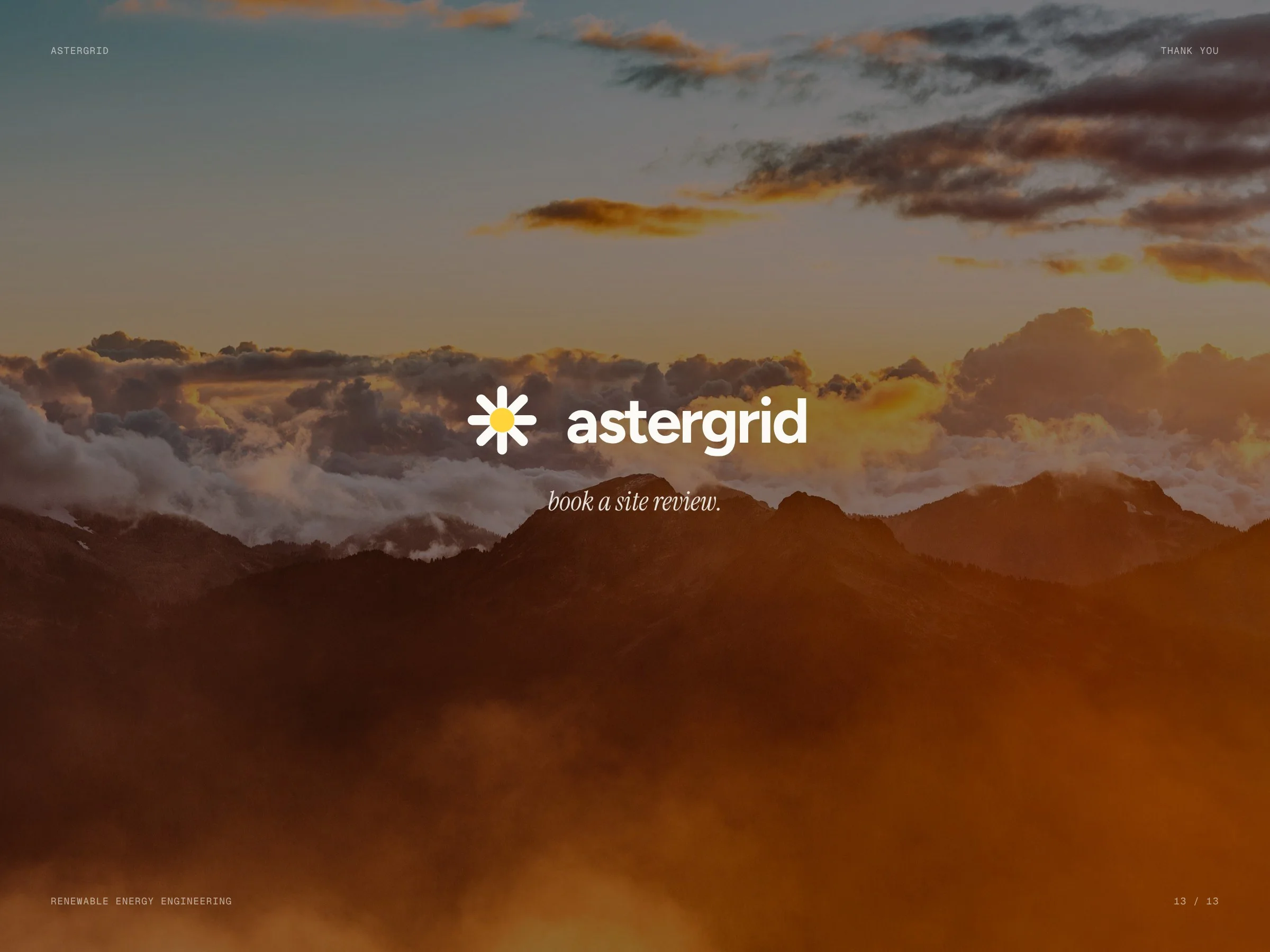
Brand identity for an engineering firm that takes solar, wind and storage projects from permit to first power: a sun drawn like a marker on a site plan, ink and paper, one warm core.
- Client
- Astergrid
- Industry
- Renewable energy engineering
- Scope
- Logo · Colour · Type · Print · Signage
- Format
- Identity system
- Year
- 2026
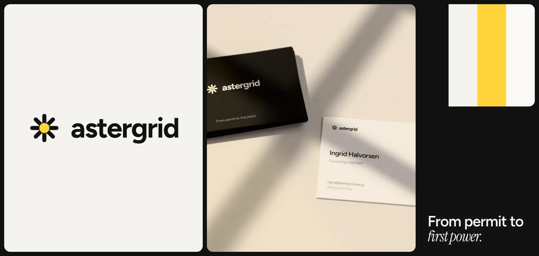
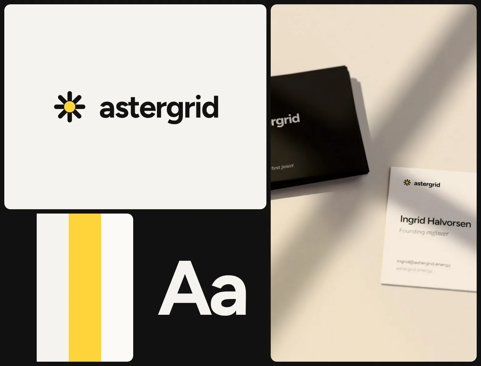
A sun drawn the way an engineer would draw it.
An engineering firm for solar, wind and storage developers needs a brand that looks as calm and exact as its work — and that runs the same on a feasibility report, a site sign and the website.
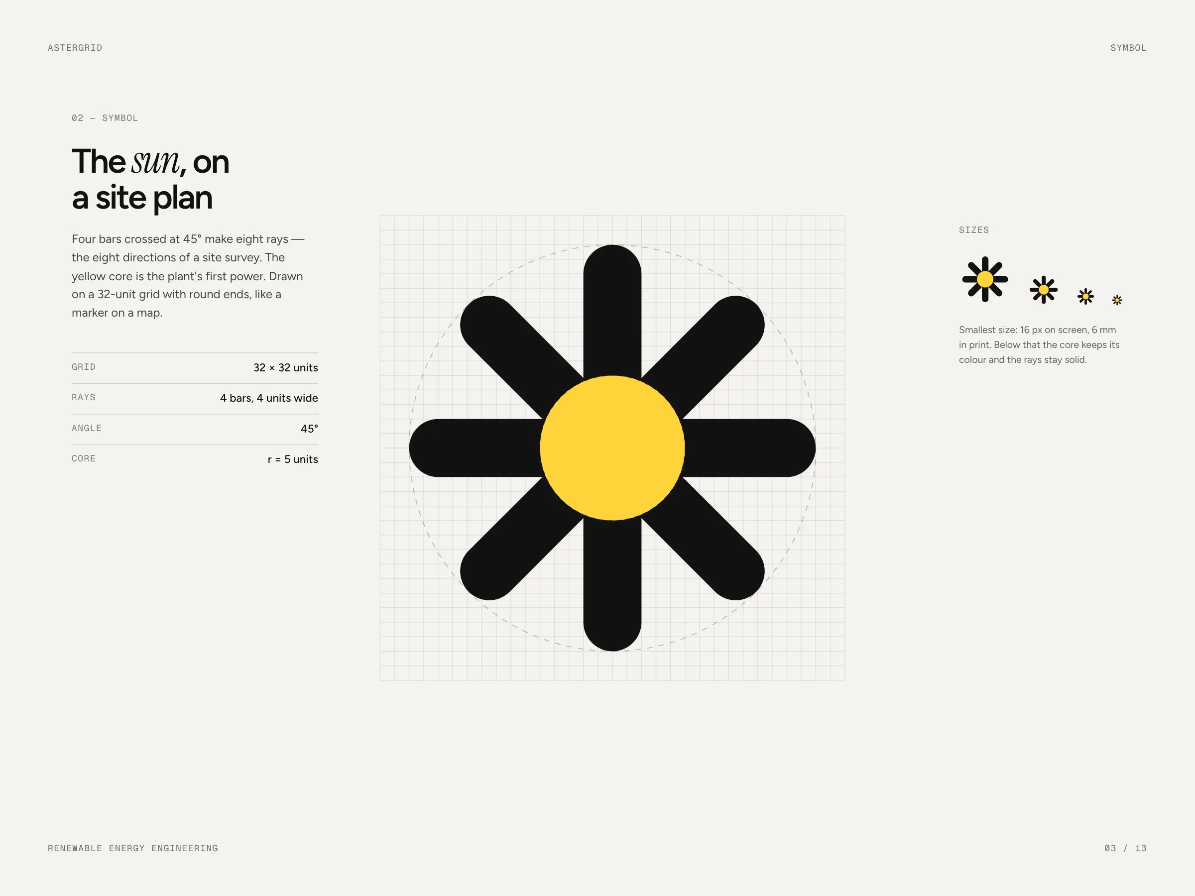
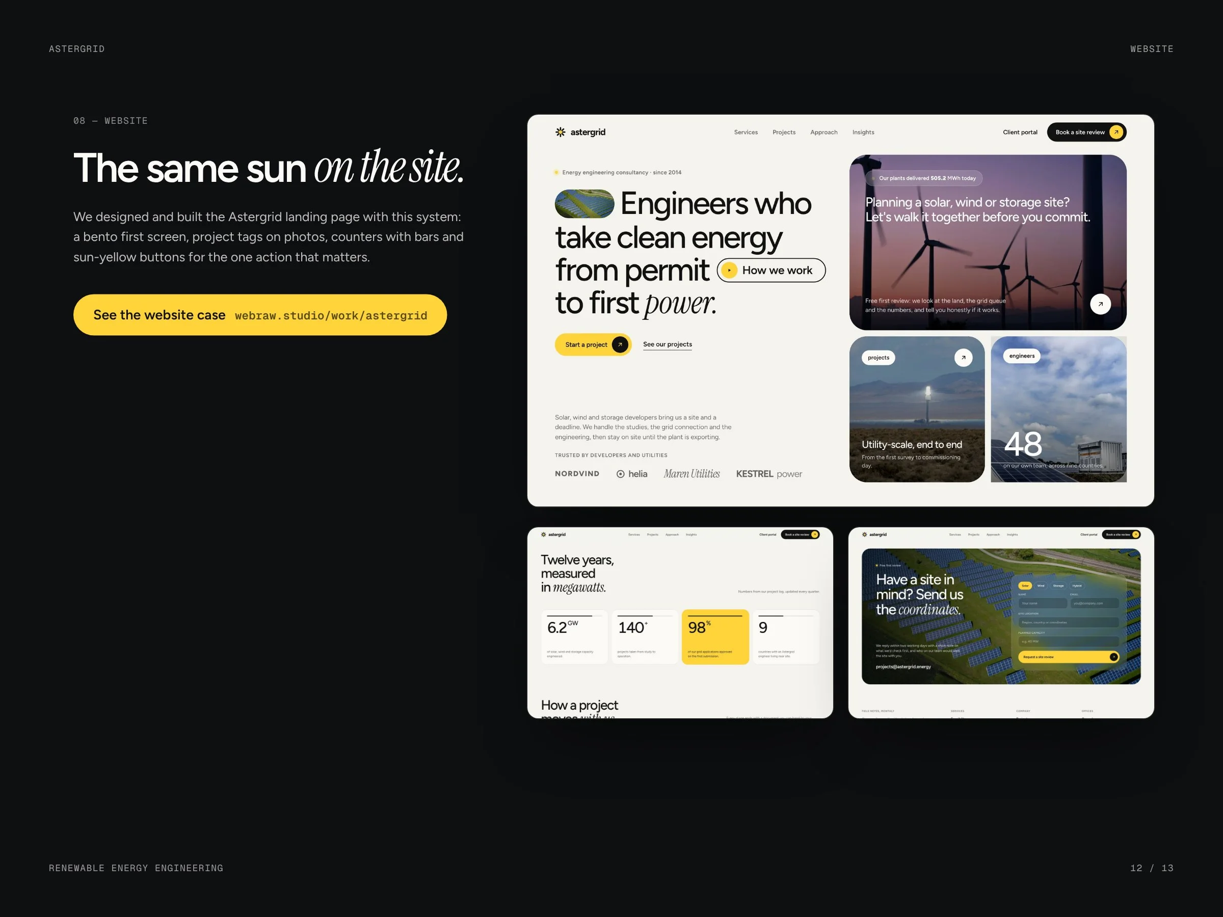
Four bars crossed at 45° make eight rays; the yellow core is the plant's first power. Around it: Figtree for everything, Instrument Serif Italic for one accent word, ink and paper as the base and sun yellow only for the core and the main action. The same system runs the website we designed and built for Astergrid.
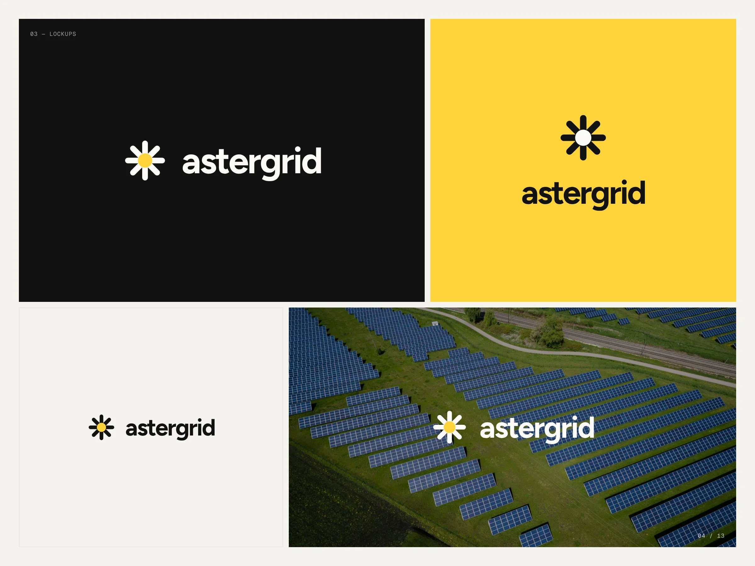
One warm core.
Ink and paper carry everything; sun yellow is kept for the core of the mark and the one action on a page.
- Ink#111211
- Paper#F4F3EE
- Sun#FFD43B
- White#FBFAF7
- Night#0D0F10
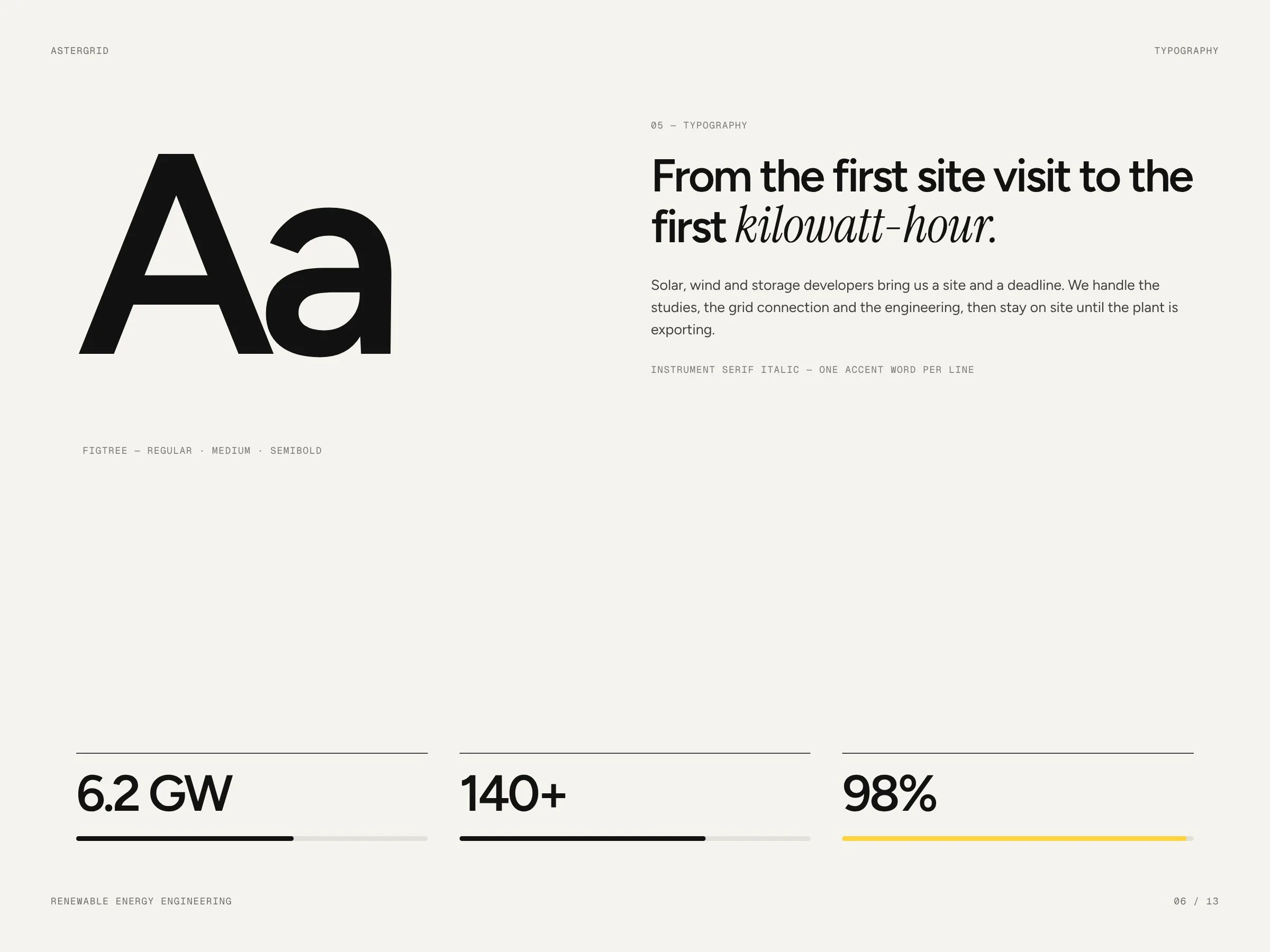
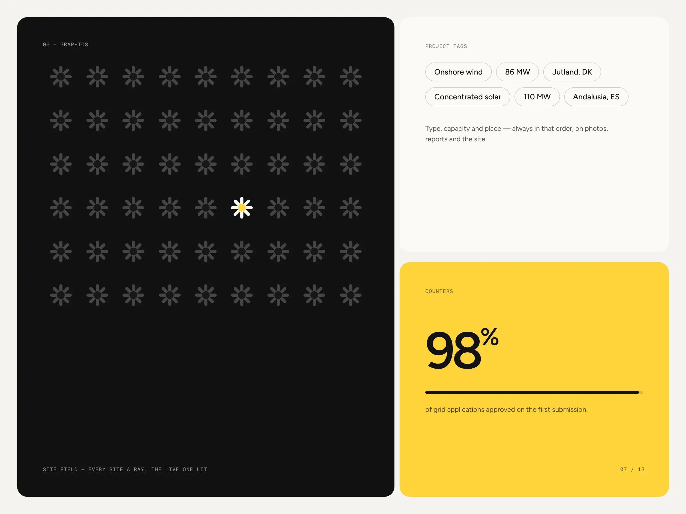
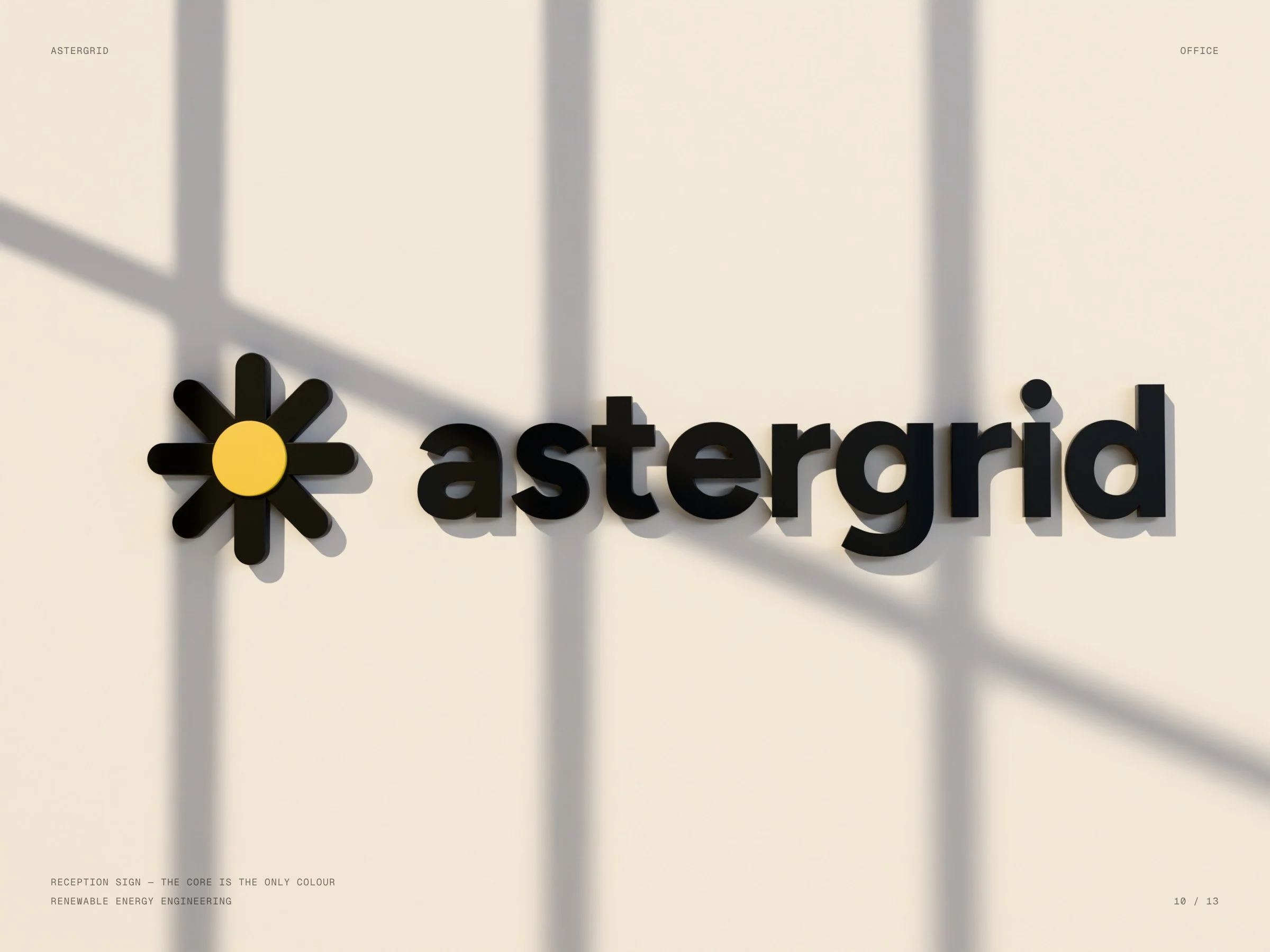
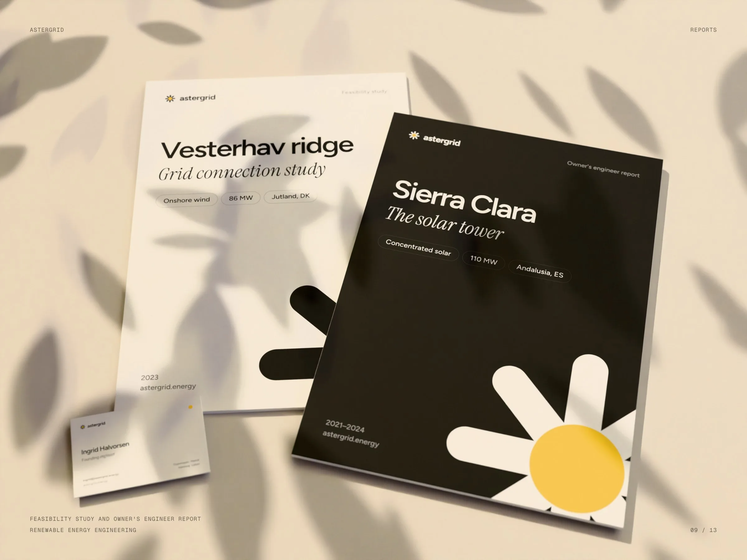
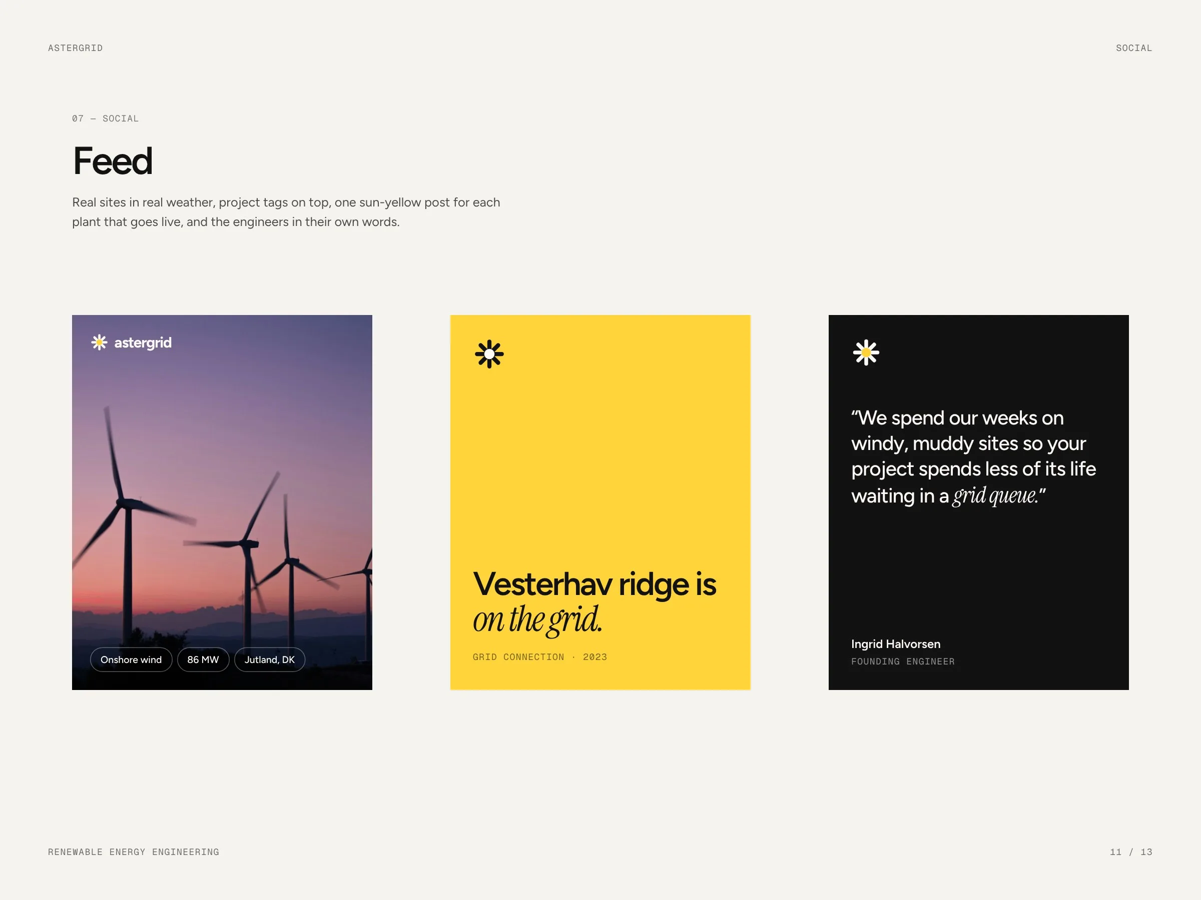
From the business card to the report.
01 — 03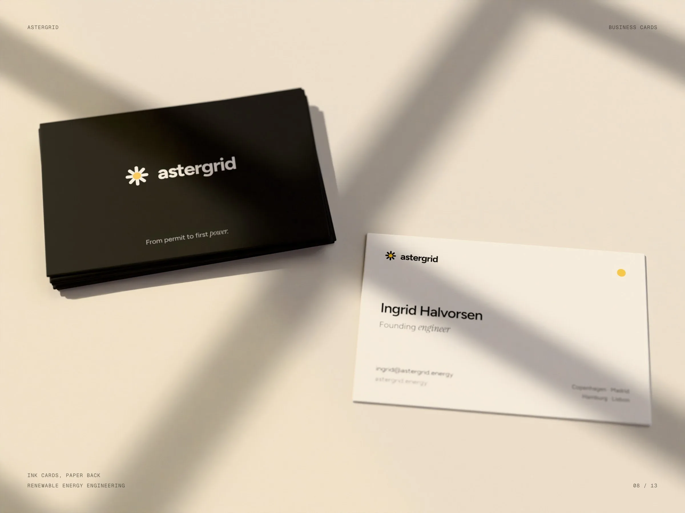
From permitto firstpower.
The promise of the firm, and the line under the logo.
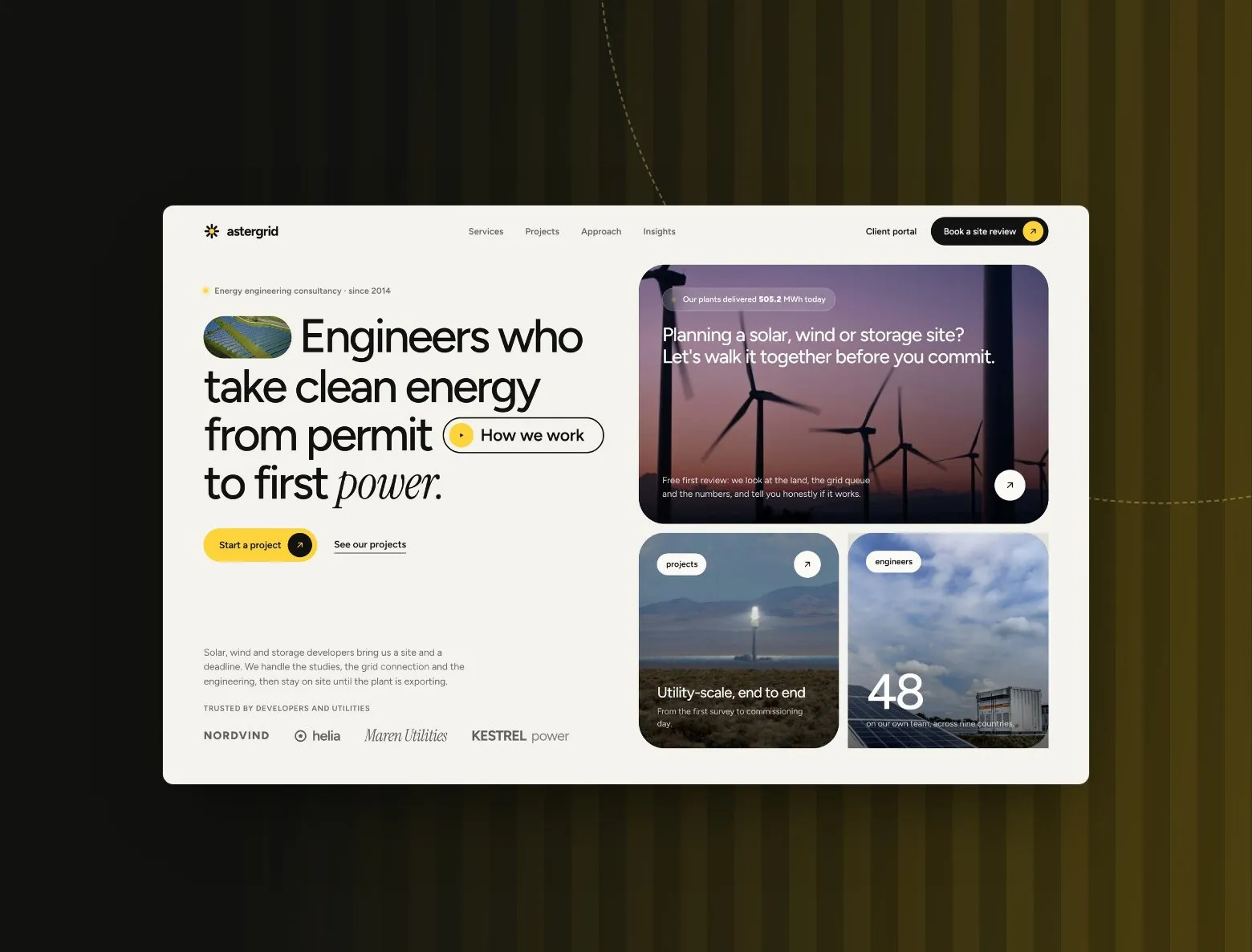
See the website
Landing page for a solar, wind and storage engineering firm
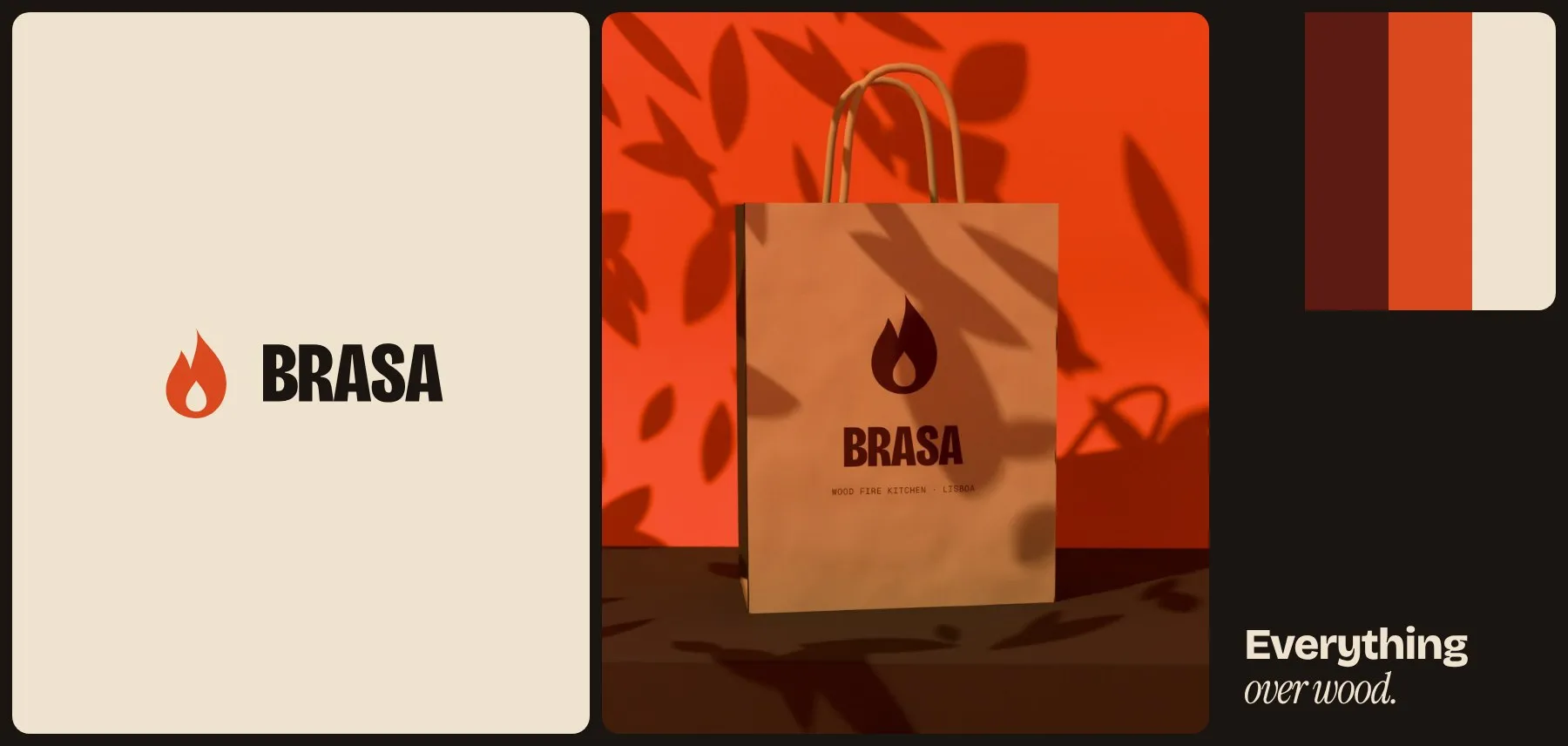
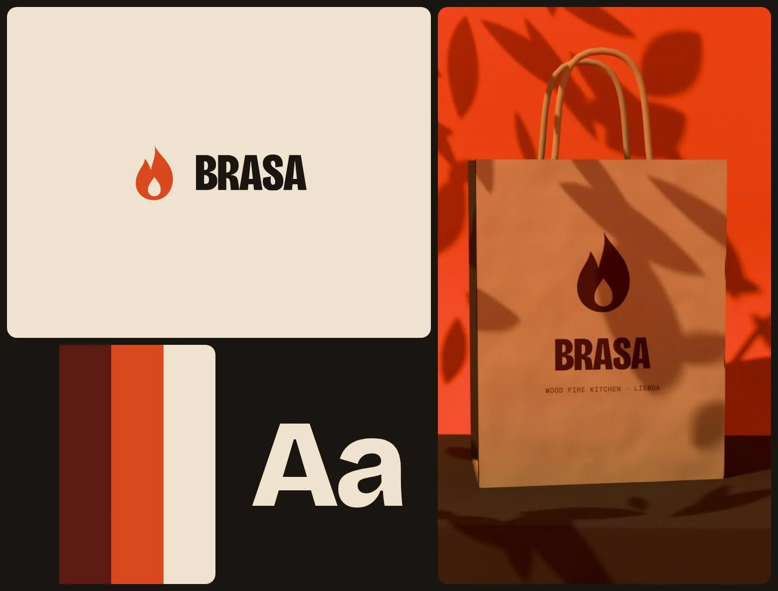
Brasa
Let’s launch.
Send a short brief or a link to your current site. You’ll get a clear plan, timeline and quote — no sales call required.
- Reply within one business day
- Design, build and launch by one team
- One week of post-launch support included
Brief sent.
Thanks — we’ll read it and come back with a plan, a timeline and a quote.