
Brasa
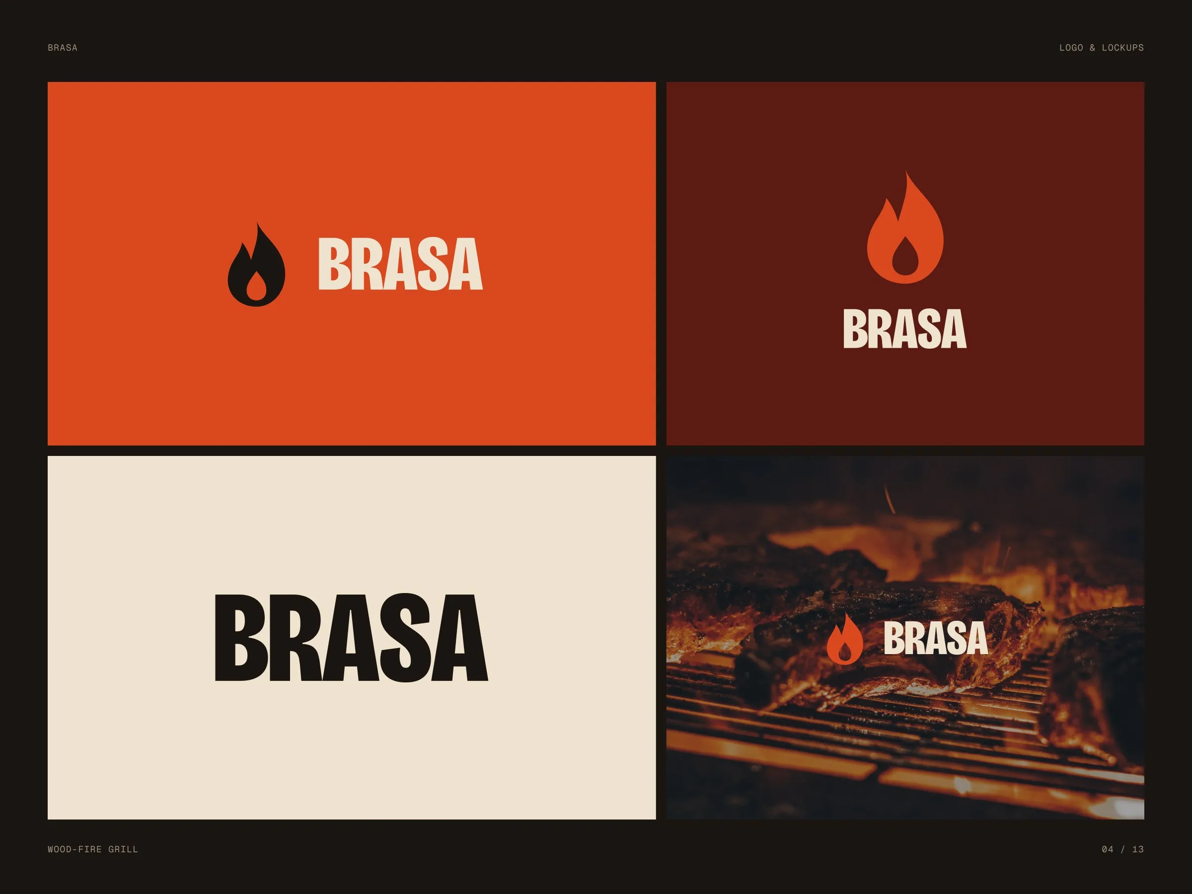
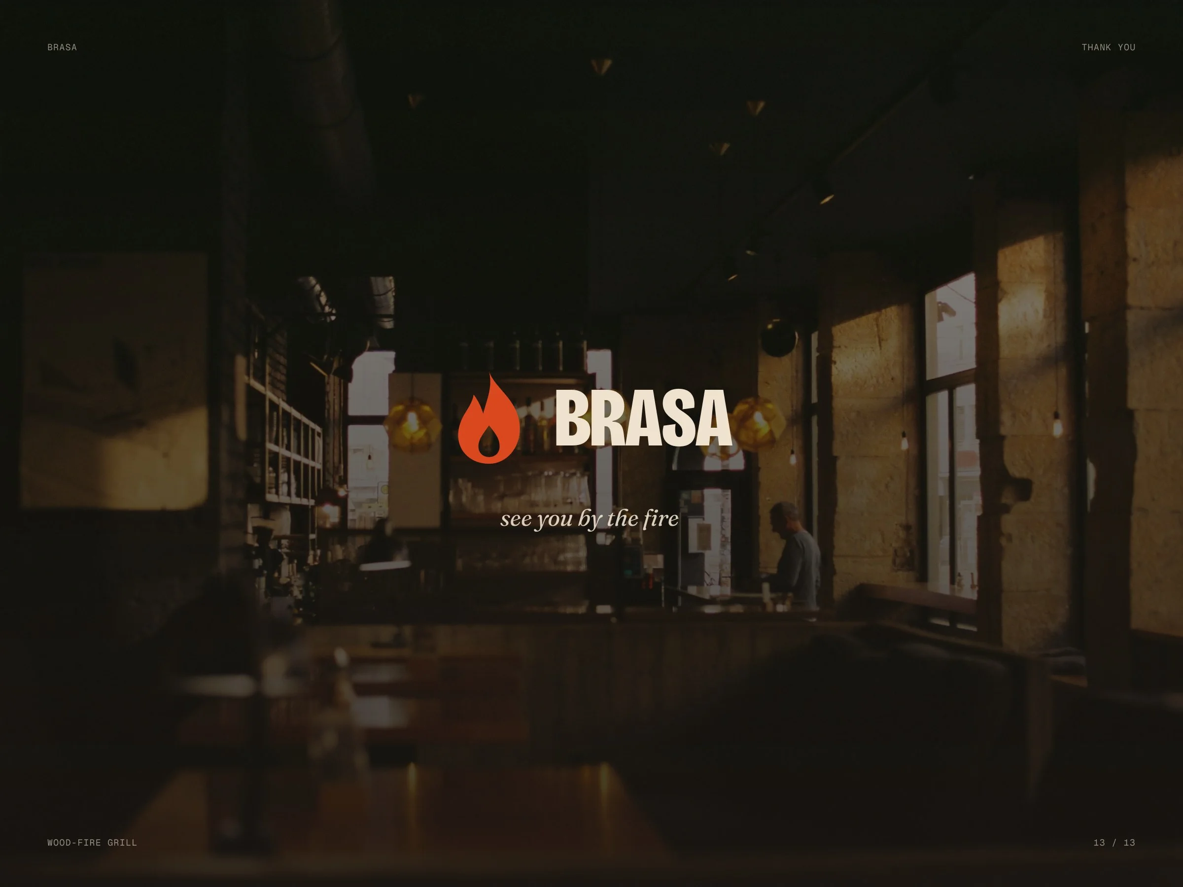
Identity concept for a restaurant that cooks only over wood: a flame with an ember inside, a heavy condensed name and colours taken from the fire.
- Client
- Brasa — studio concept
- Industry
- Restaurant
- Scope
- Logo · Colour · Type · Print · Signage
- Format
- Identity system
- Year
- 2026
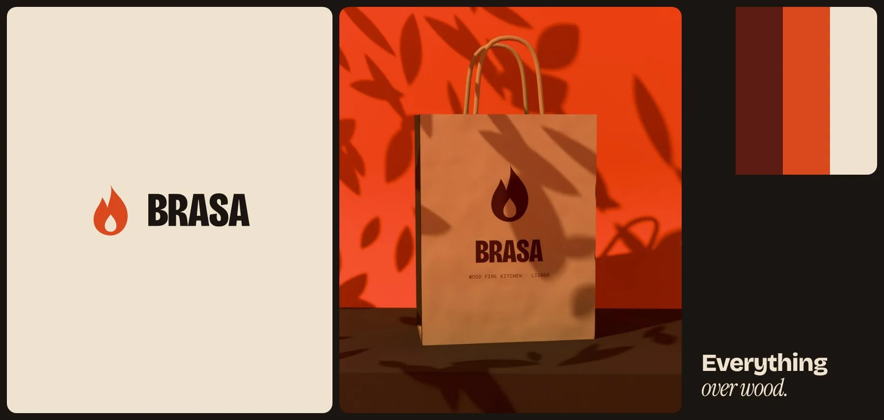
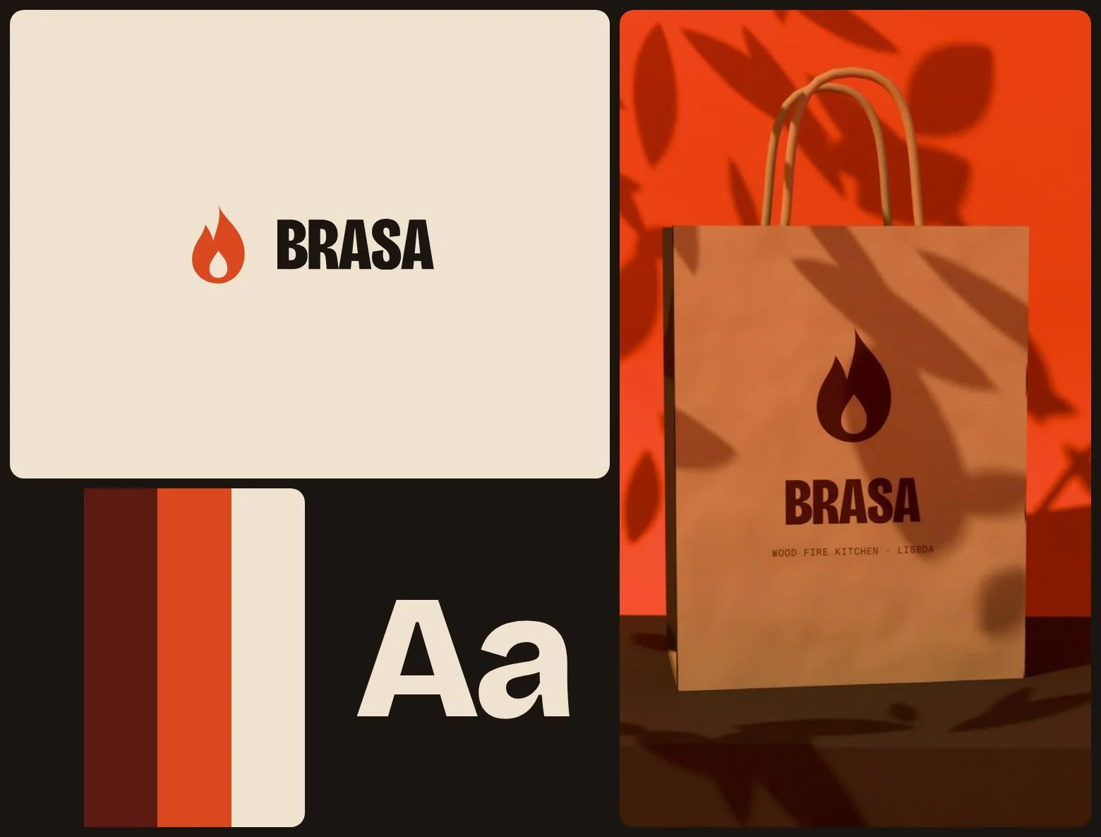
A brand you could burn into a wooden board.
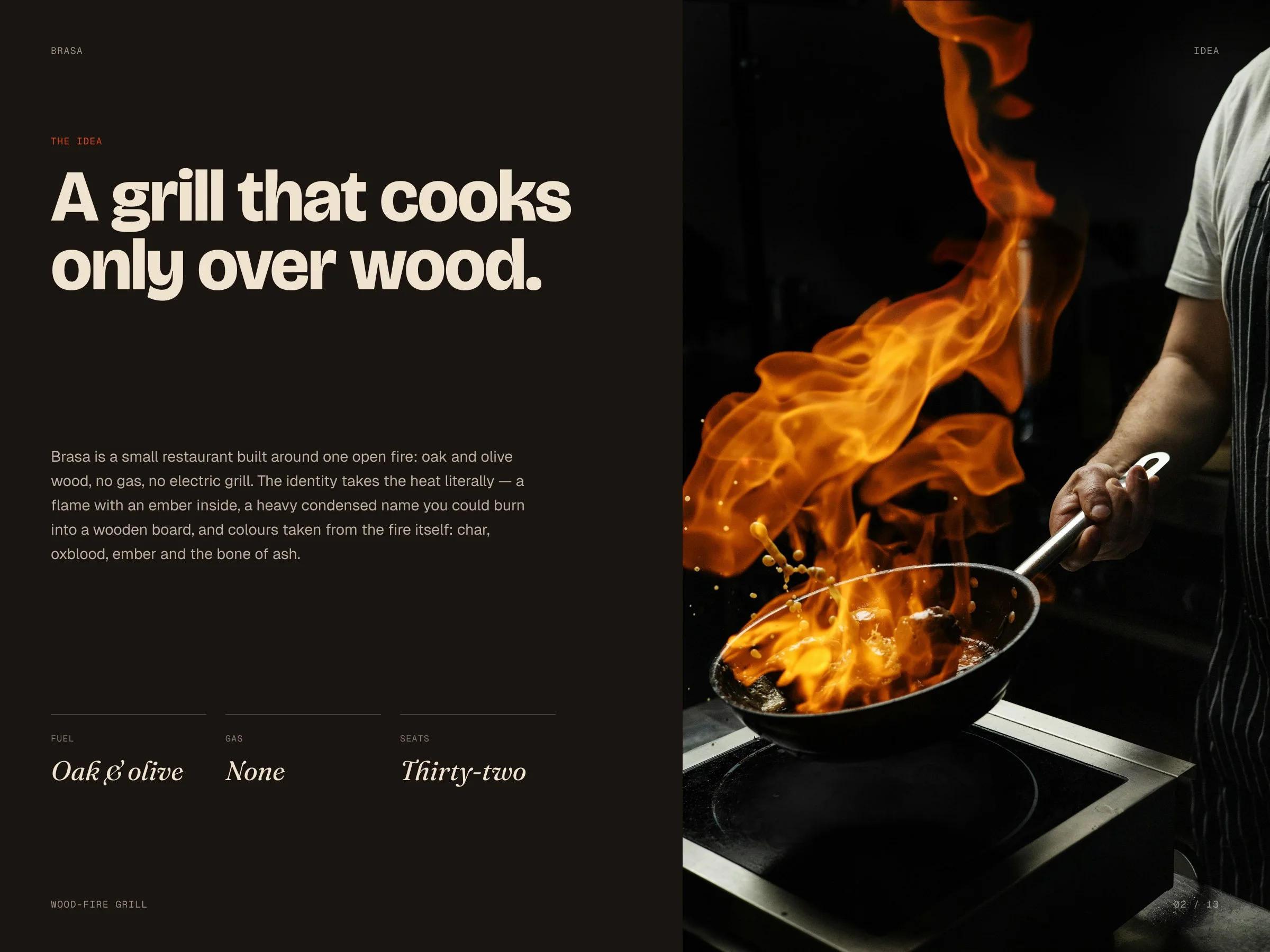
A self-initiated concept. Grill restaurants tend to look either rustic or like a steakhouse chain. We wanted something warmer and sharper, made from the one thing the kitchen is built around — the fire.
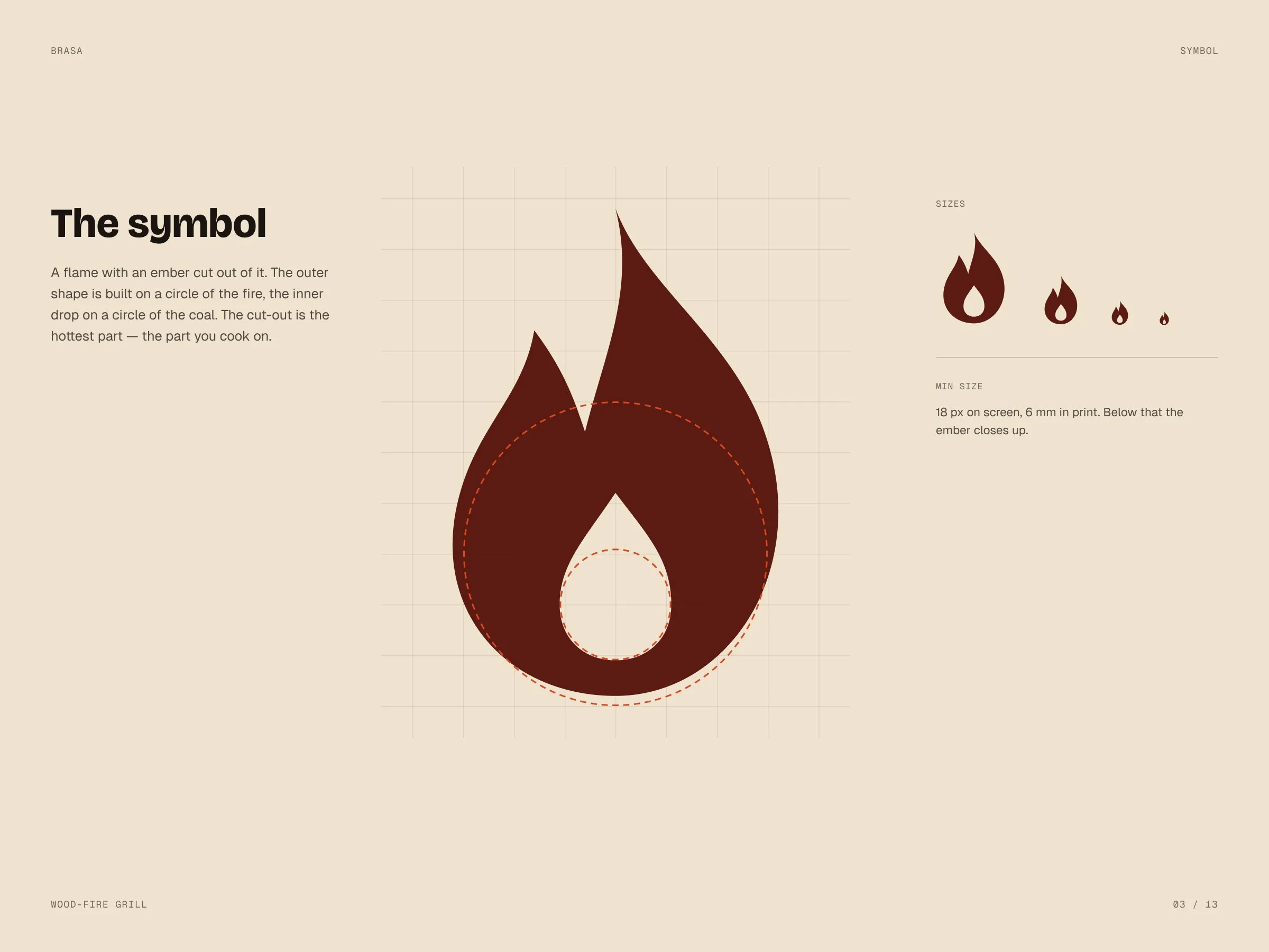
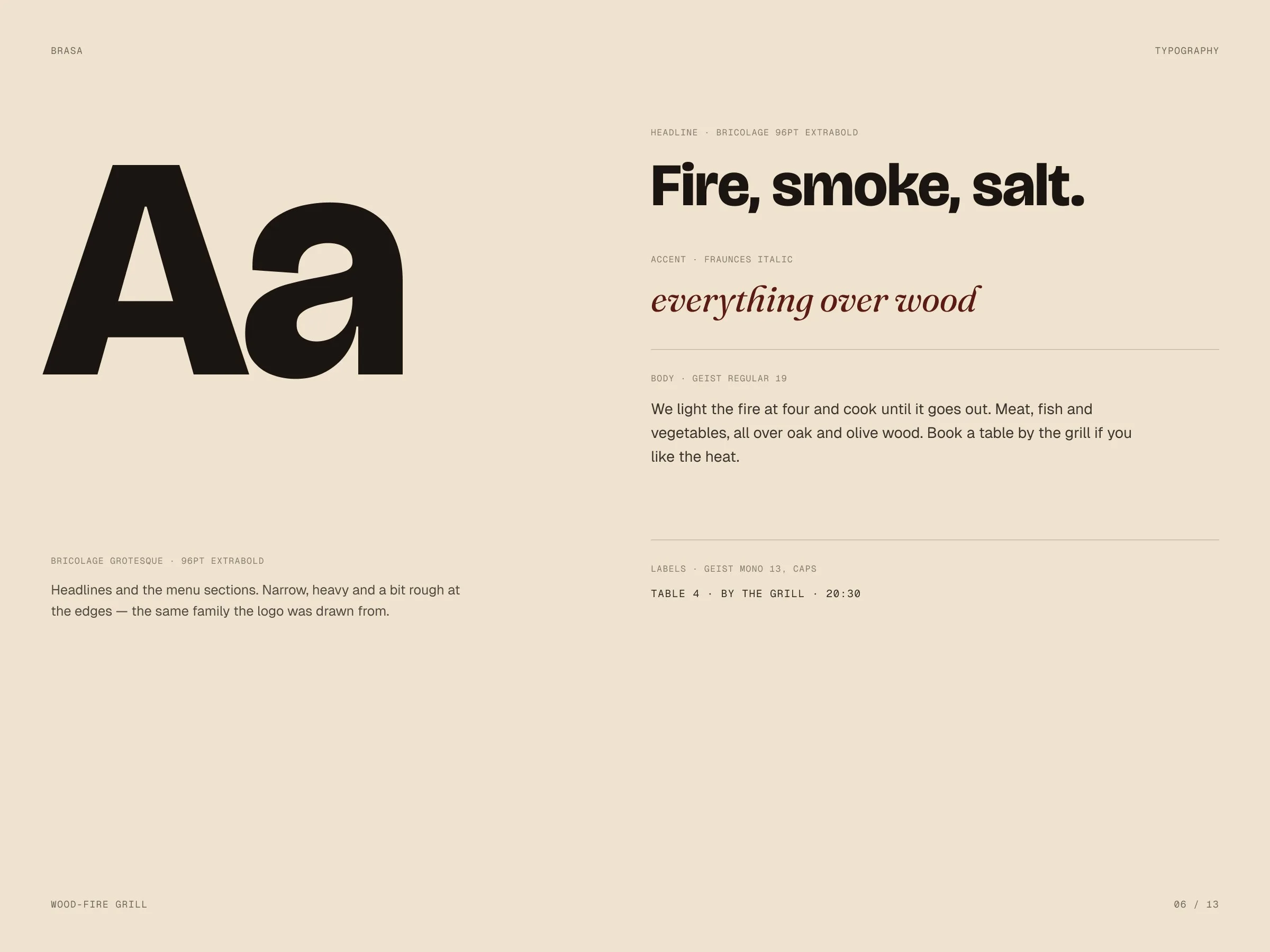
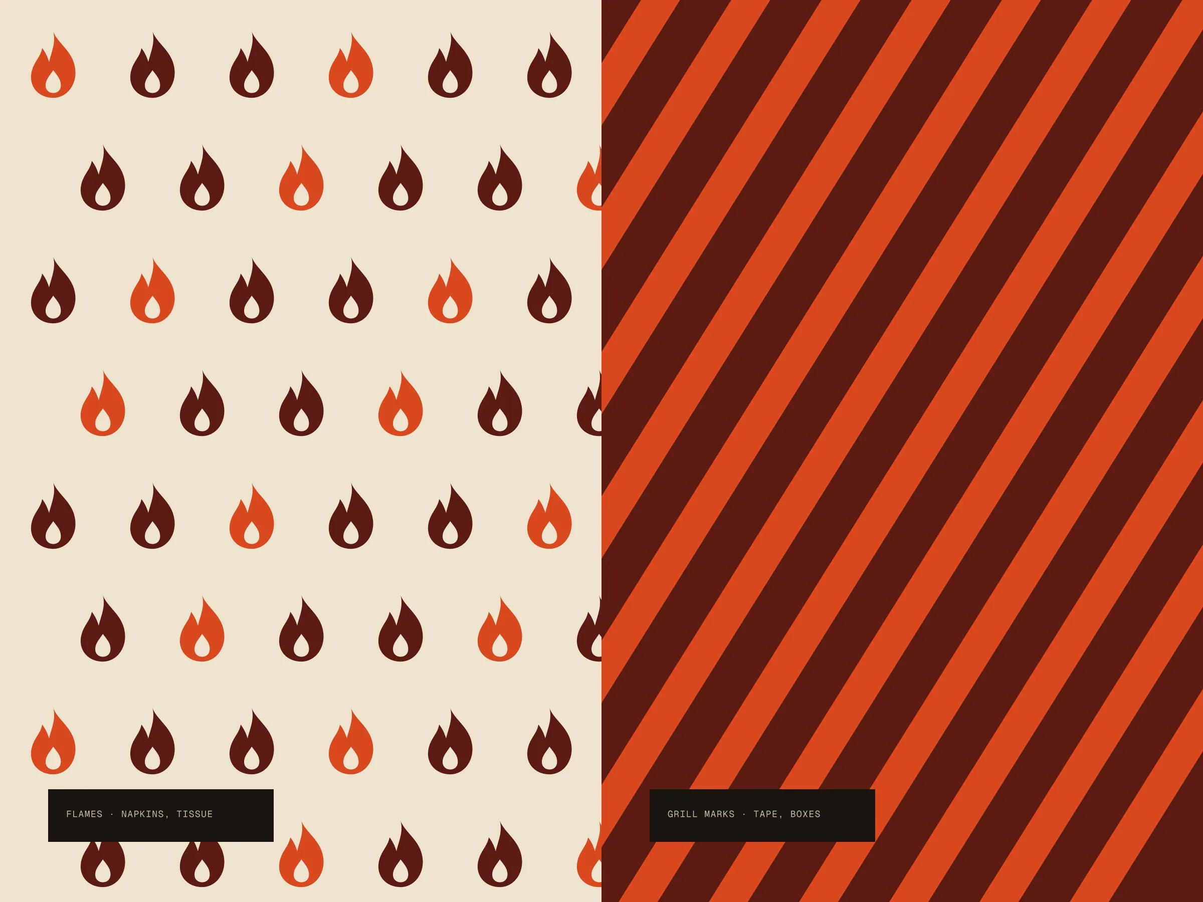
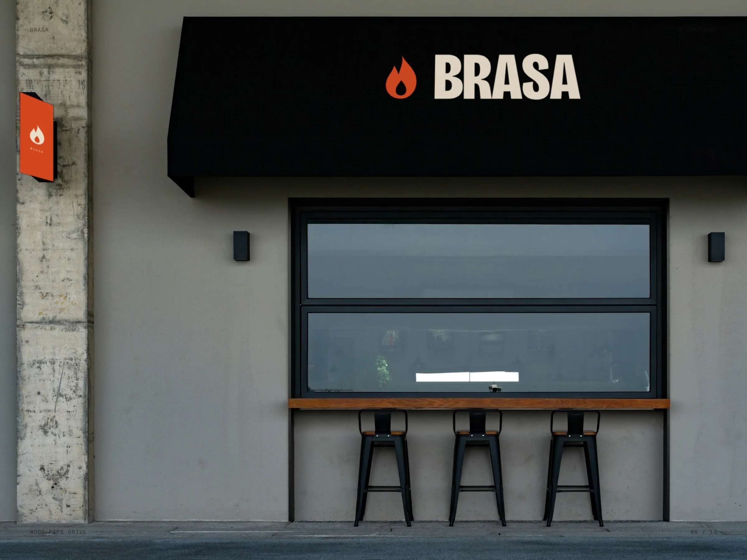
The symbol is a flame with an ember cut out of it. The name is set heavy and narrow so it reads on an awning and a matchbox alike. Char, oxblood, ember and bone come straight from the grill, with two patterns — flames and grill marks — for napkins, tape and boxes.
The identity in motion
Our own app made these loops from the identity’s own elements — its Layers and Collage templates, no After Effects.
Colours of the fire.
Char and oxblood to stand on, ember for the flame, bone for paper and type on dark.
- Char#1B1512
- Oxblood#5B1A12
- Ember#D9481E
- Bone#EFE3CF
- Smoke#8C7F72
From the menu to the matches.
01 — 03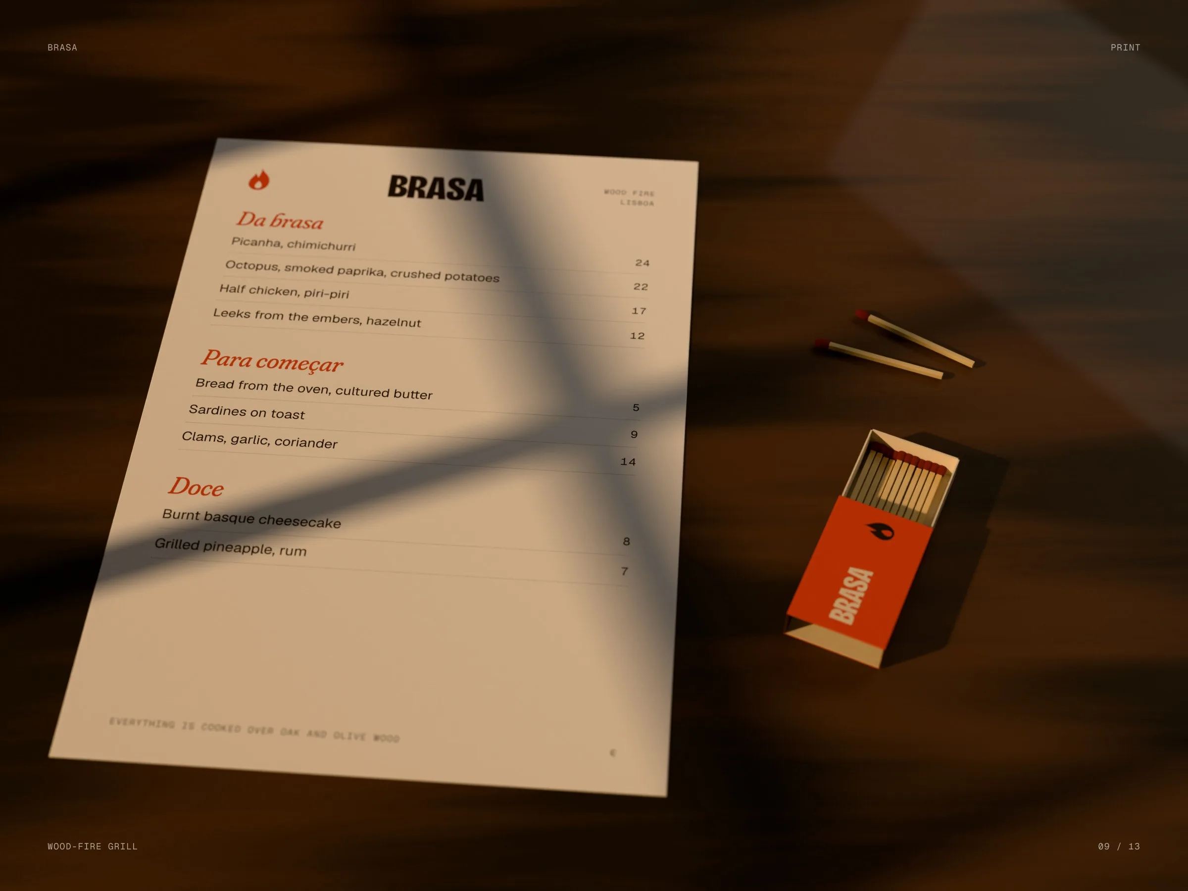
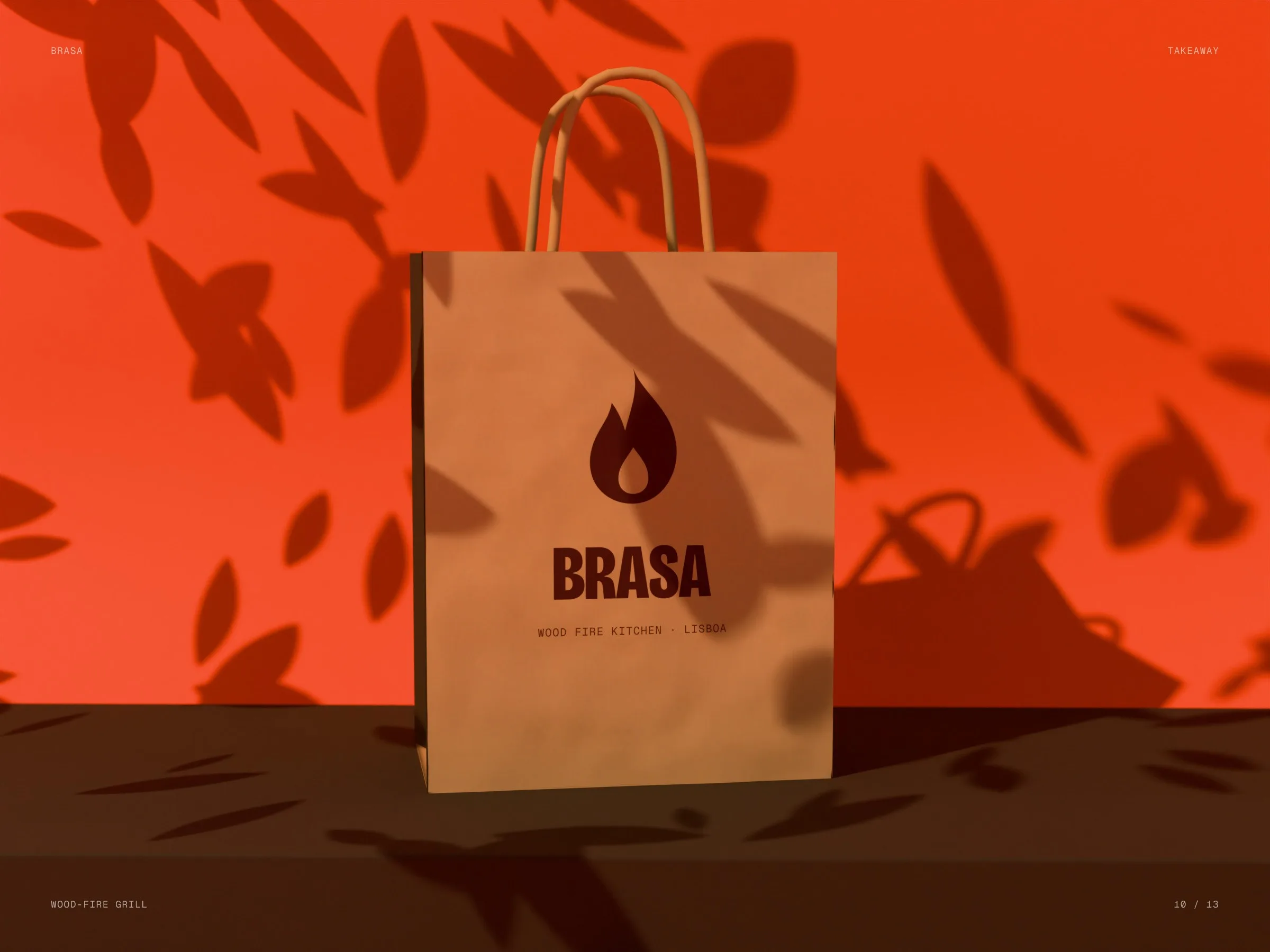
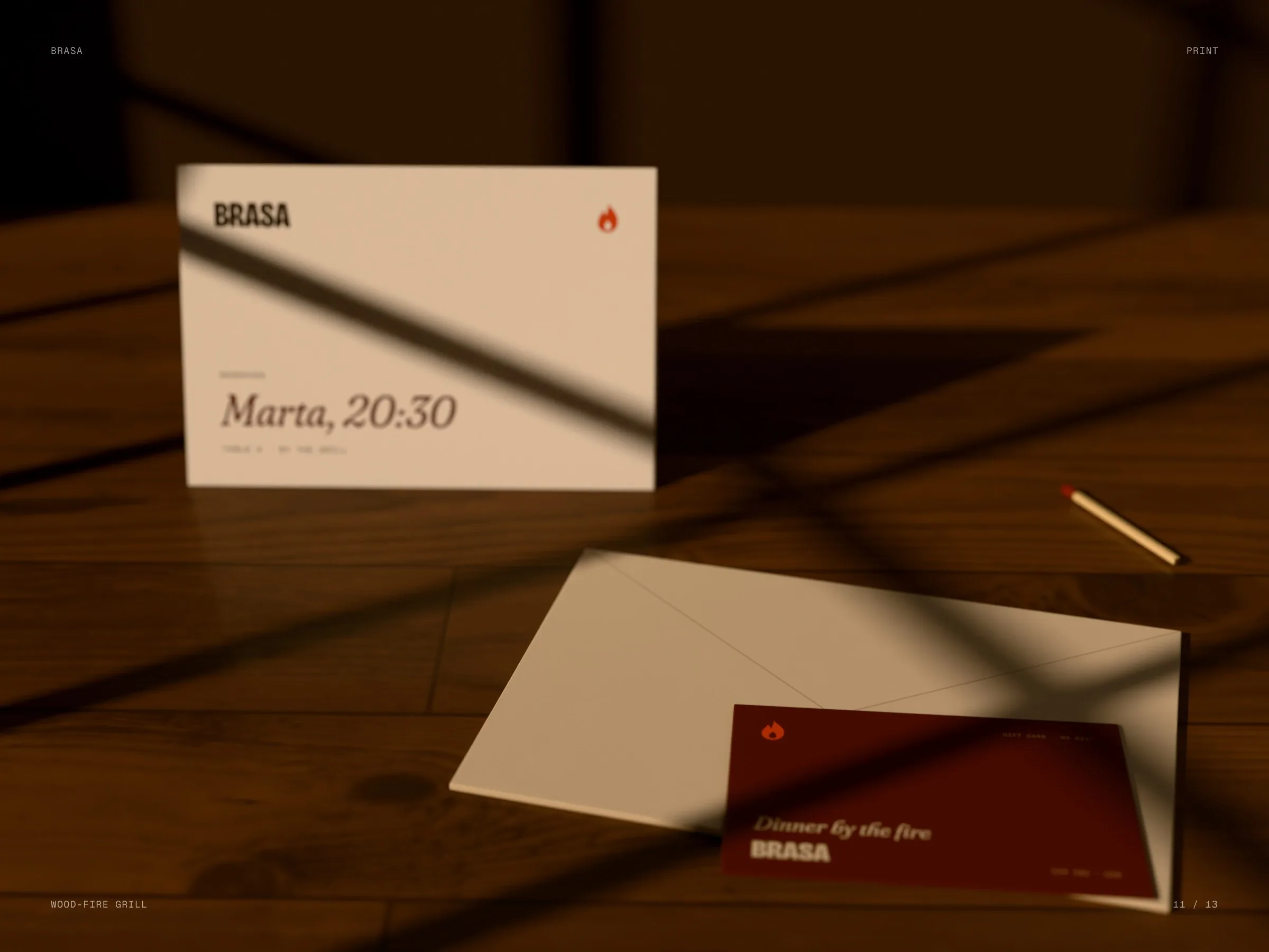
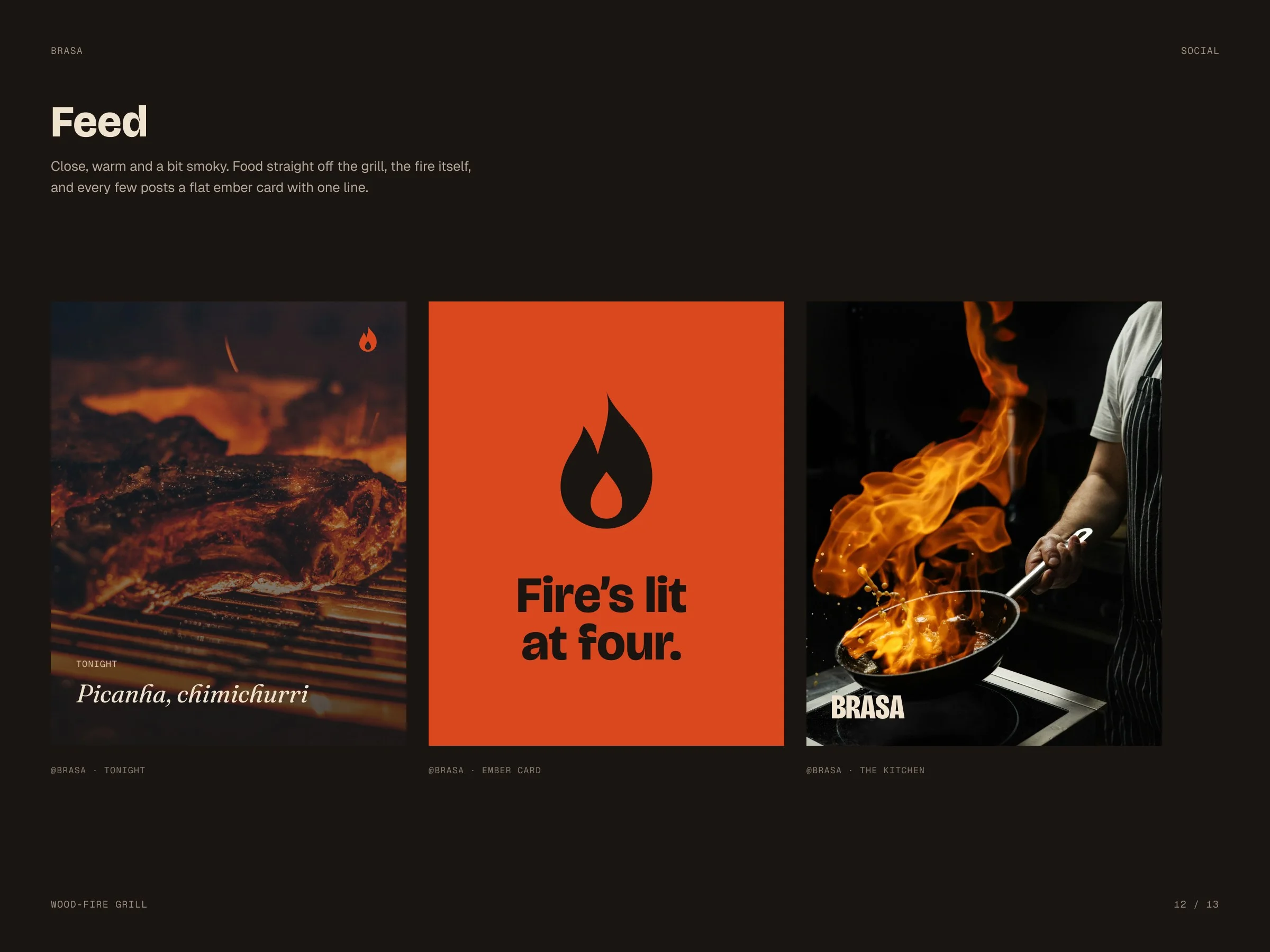
Everythingoverwood.
The promise of the kitchen, said in three words.
web.raw/studio
Let’s launch.
Send a short brief or a link to your current site. You’ll get a clear plan, timeline and quote — no sales call required.
- Reply within one business day
- Design, build and launch by one team
- One week of post-launch support included
Brief sent.
Thanks — we’ll read it and come back with a plan, a timeline and a quote.