
BRISCA
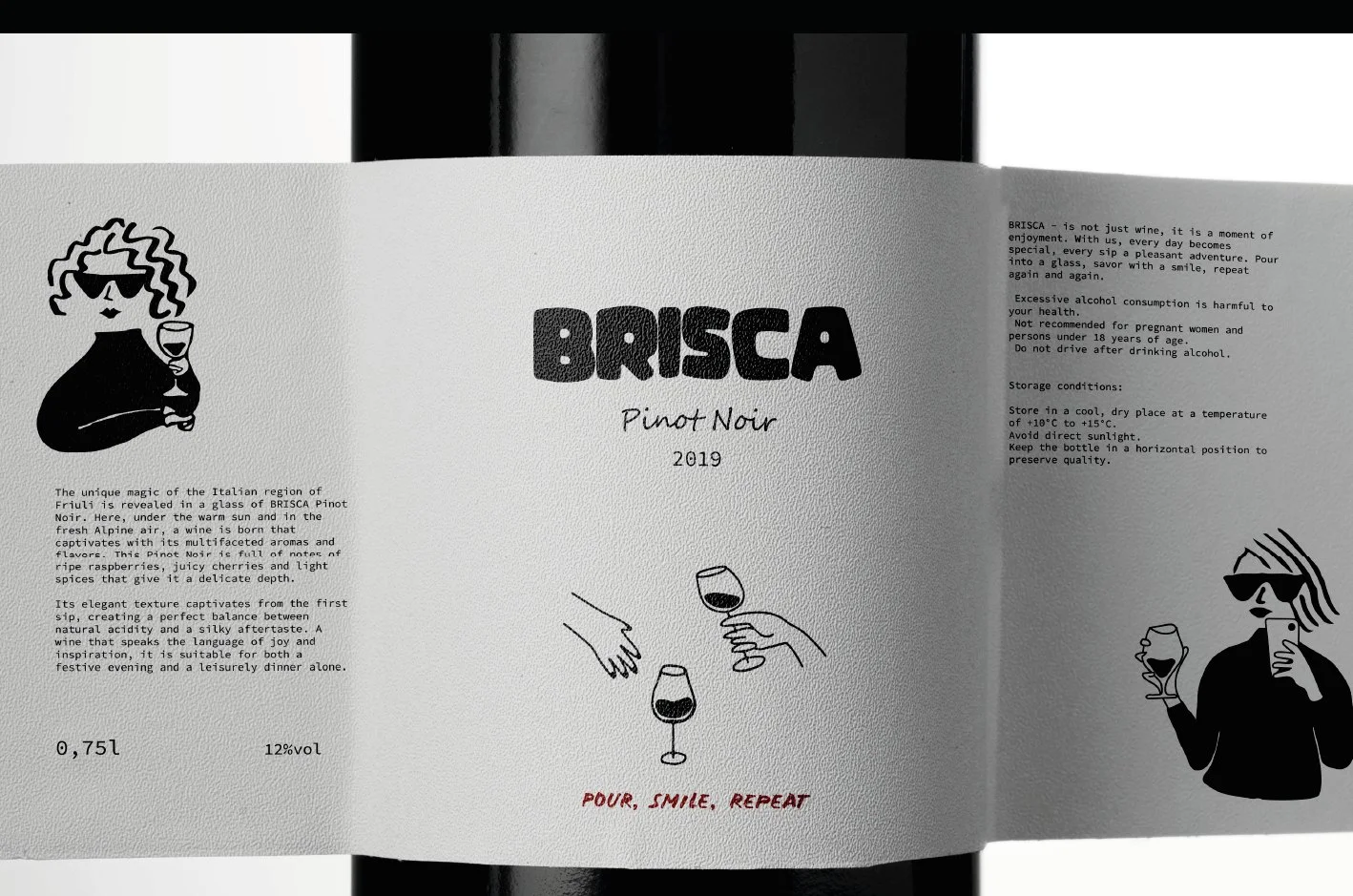
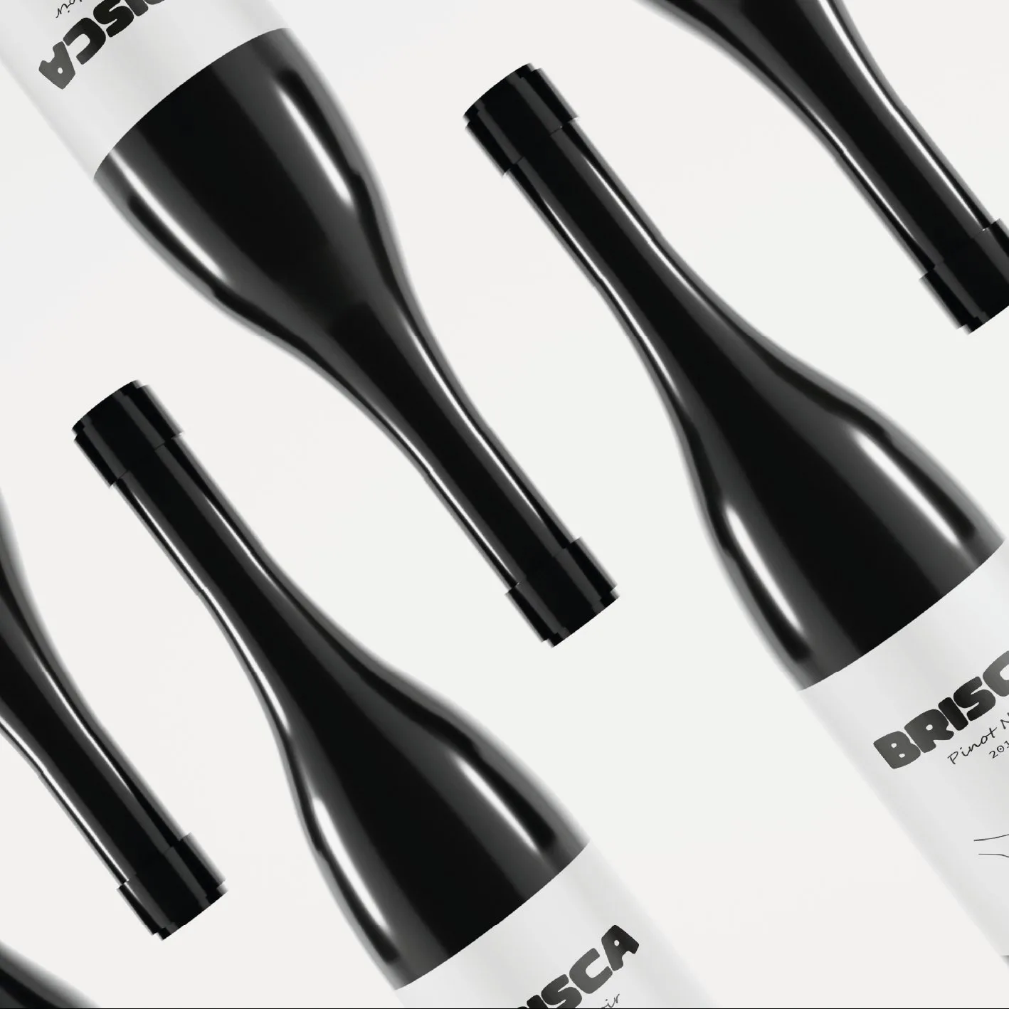
Branding and packaging for BRISCA Pinot Noir from Friuli: a heavy rounded wordmark, line drawings of people with a glass, and three colours — black, wine red and white.
- Client
- BRISCA Pinot Noir
- Industry
- Wine
- Scope
- Logo · Illustration · Label · Packaging
- Designer
- Sonya
- Year
- 2025
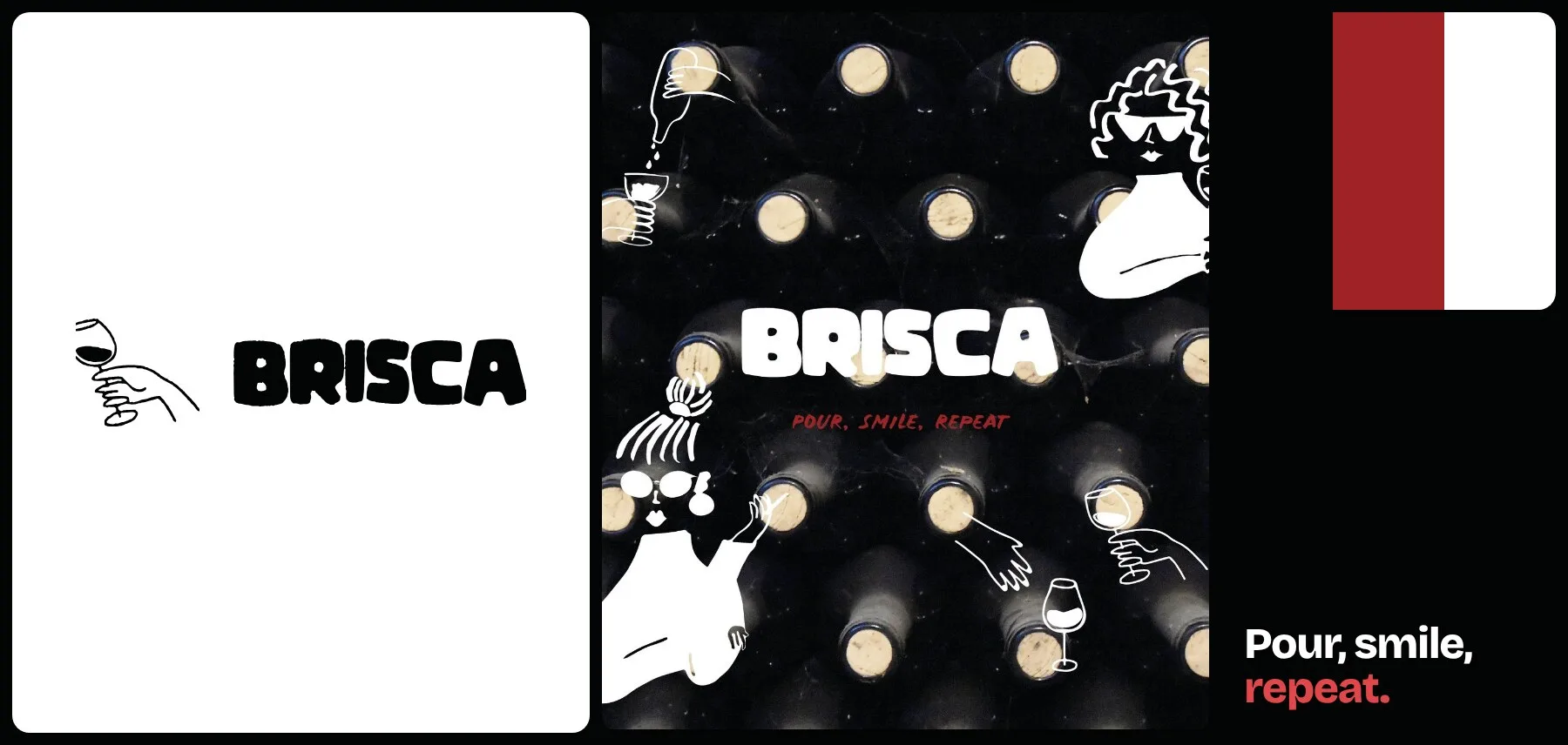
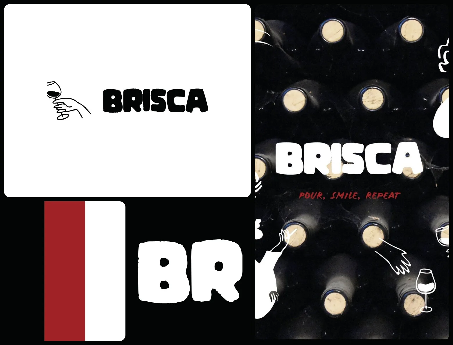
Pour, smile, repeat.
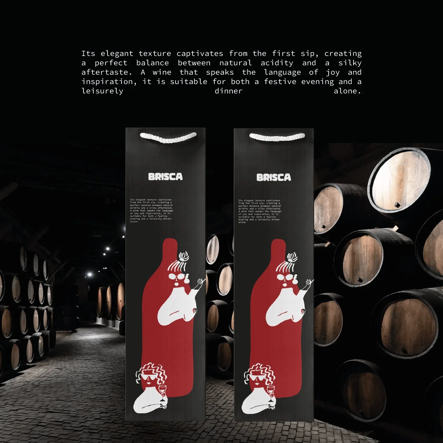
A Pinot Noir from the Italian region of Friuli, with notes of ripe raspberries, juicy cherries and light spices — made, as the label says, for a festive evening and a leisurely dinner alone alike.
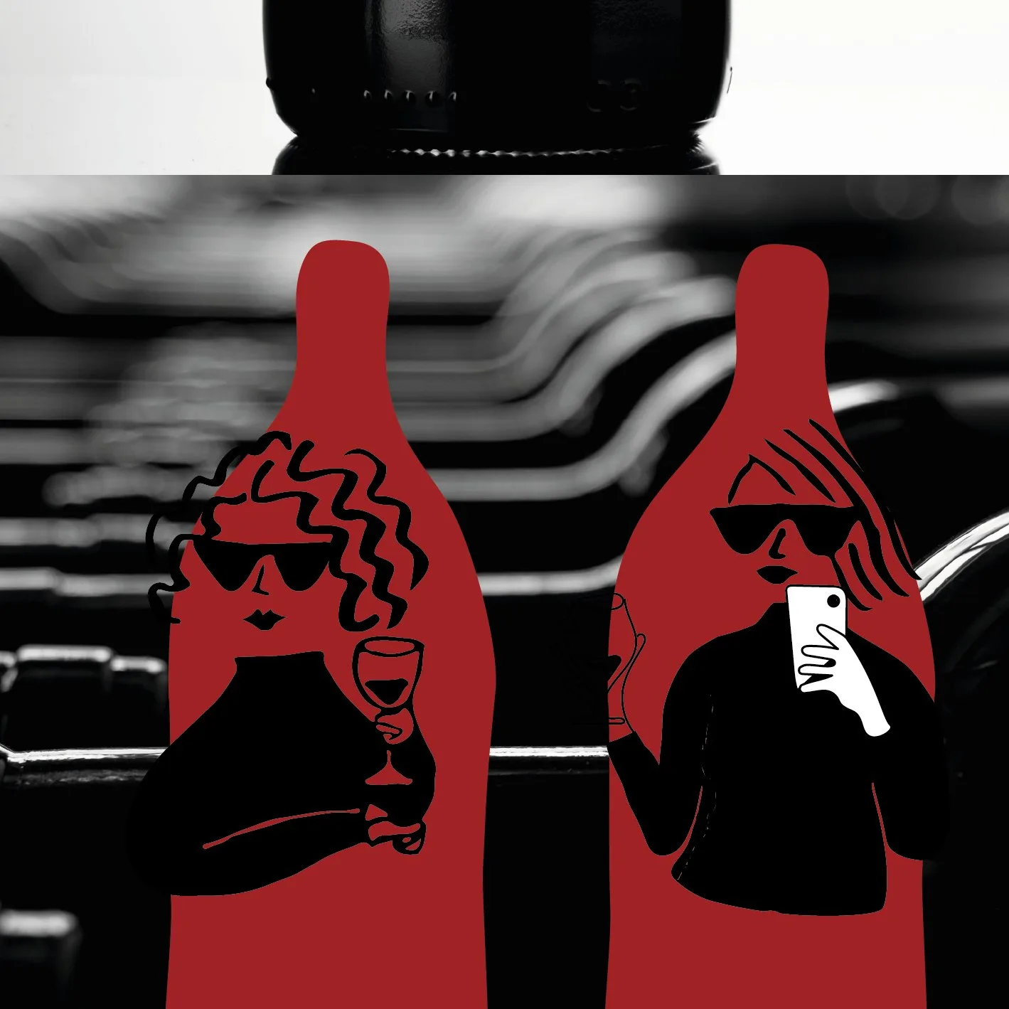
Sonya set BRISCA in a heavy, rounded wordmark and drew a cast of characters in simple black lines: women in sunglasses, hands pouring and raising glasses. The label carries the story of the wine, the gift bag turns the bottle into a red silhouette, and “Pour, smile, repeat” runs in red under the name.
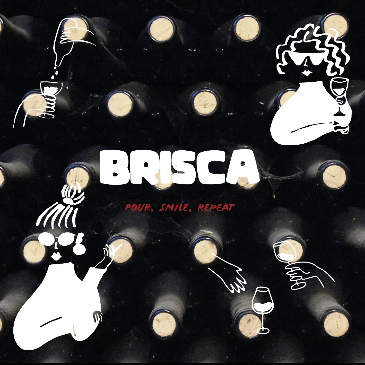
Black, wine red, white.
Black lines on white paper, white lines on black glass — and one red, for the wine and the slogan.
- Black#030404
- Wine red#A02225
- White#FFFFFF
Pour,smile,repeat.
The slogan, set in red under the name.
STRIHA

Let’s launch.
Send a short brief or a link to your current site. You’ll get a clear plan, timeline and quote — no sales call required.
- Reply within one business day
- Design, build and launch by one team
- One week of post-launch support included
Brief sent.
Thanks — we’ll read it and come back with a plan, a timeline and a quote.