
Auréole
Brand identity and packaging for a niche perfume house in Paris: a tall, narrow wordmark, five dark colours and quiet packaging for every fragrance.
- Client
- Auréole, maison de parfum
- Industry
- Perfume
- Scope
- Logo · Colour · Packaging · Print · Signage
- Designer
- Sonya
- Year
- 2025
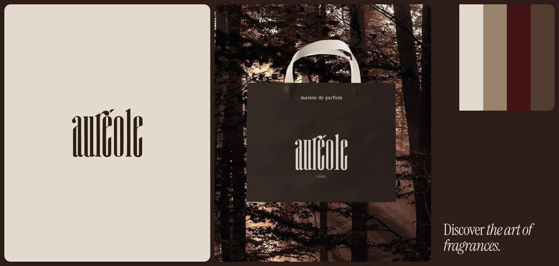
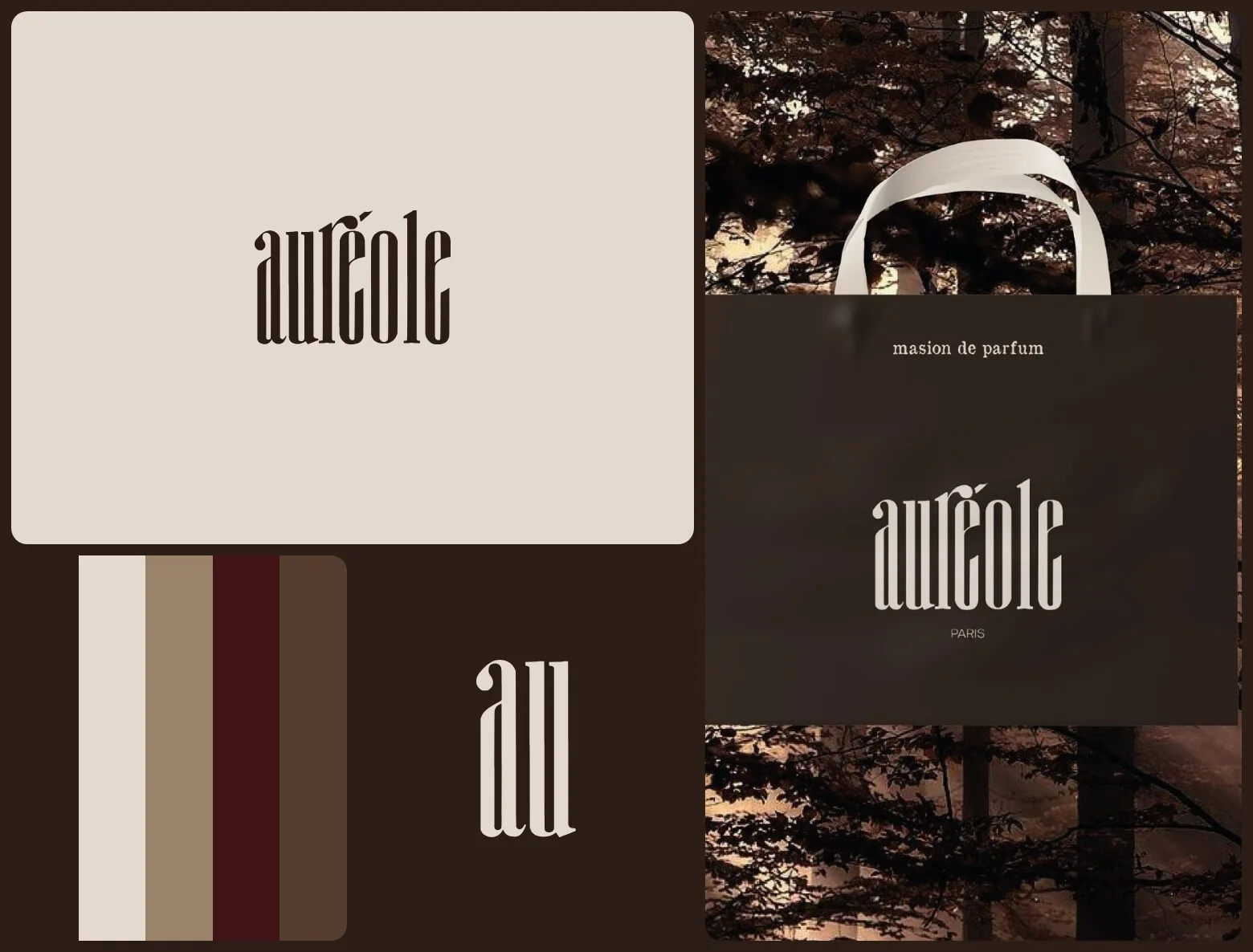
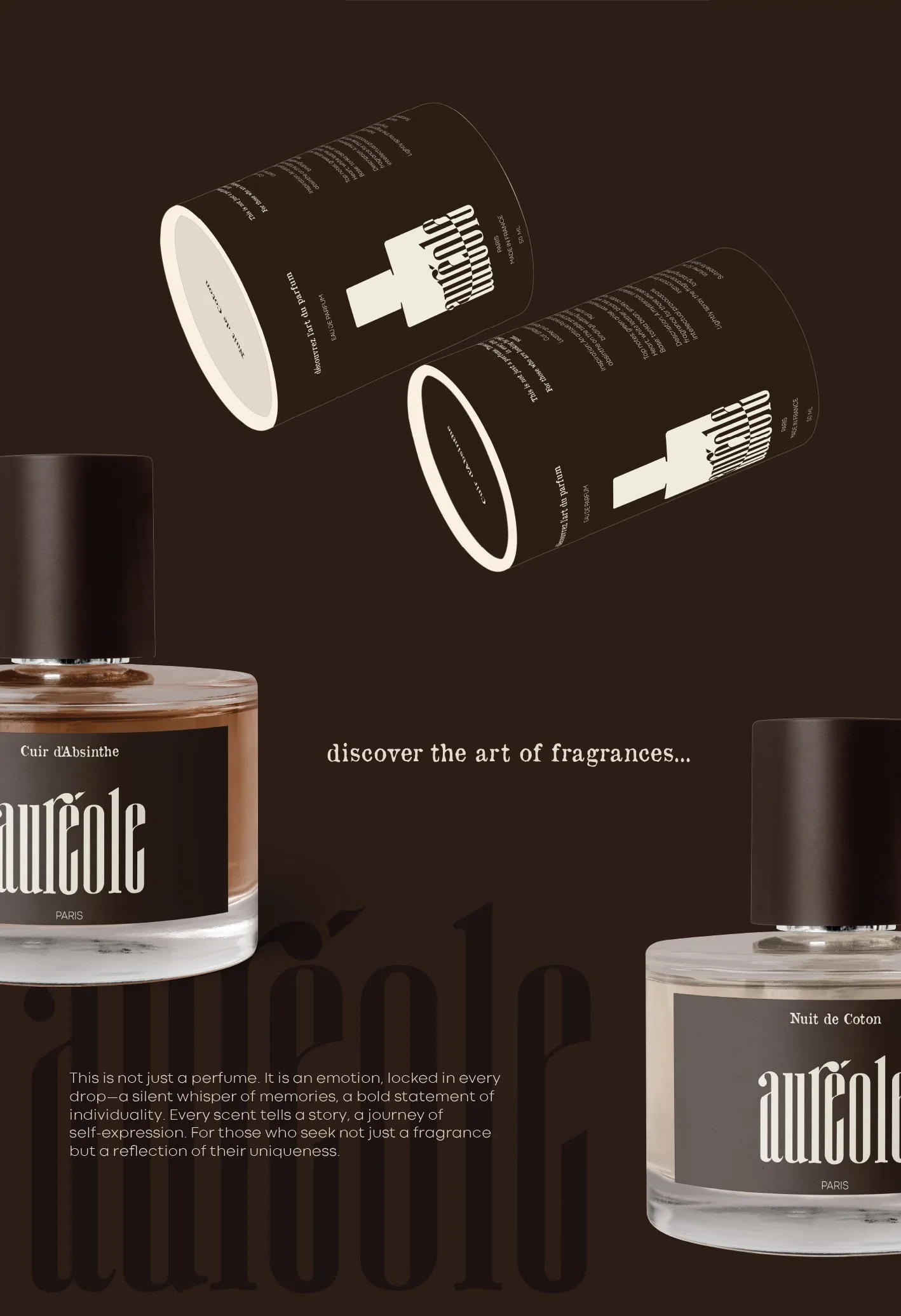
Discover the art of fragrances.
A niche fragrance house in Paris, “capturing the essence of elegance and emotion” in its own words, needs a brand that reads as one name on a bottle, a tube, a bag and a shop front.
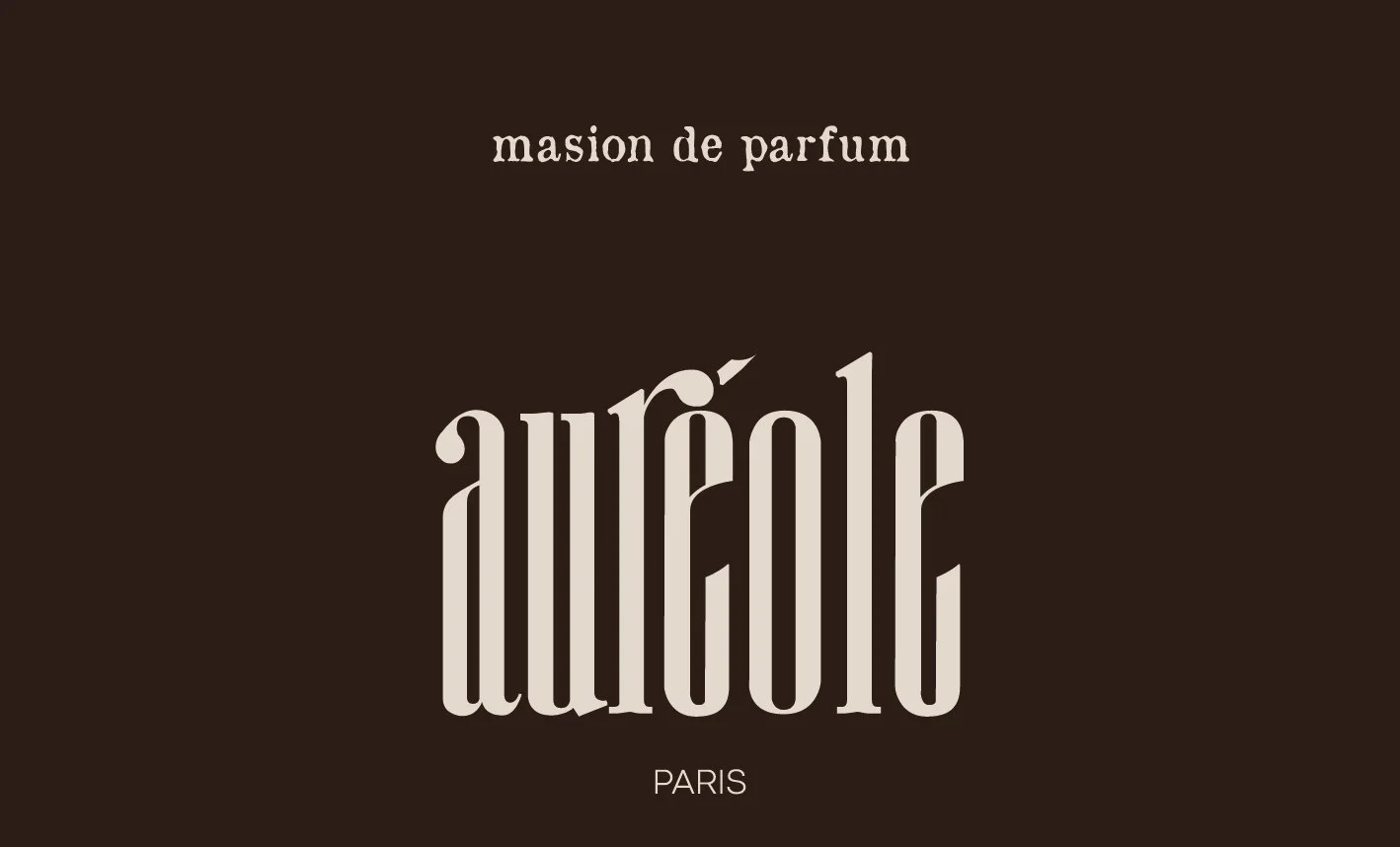
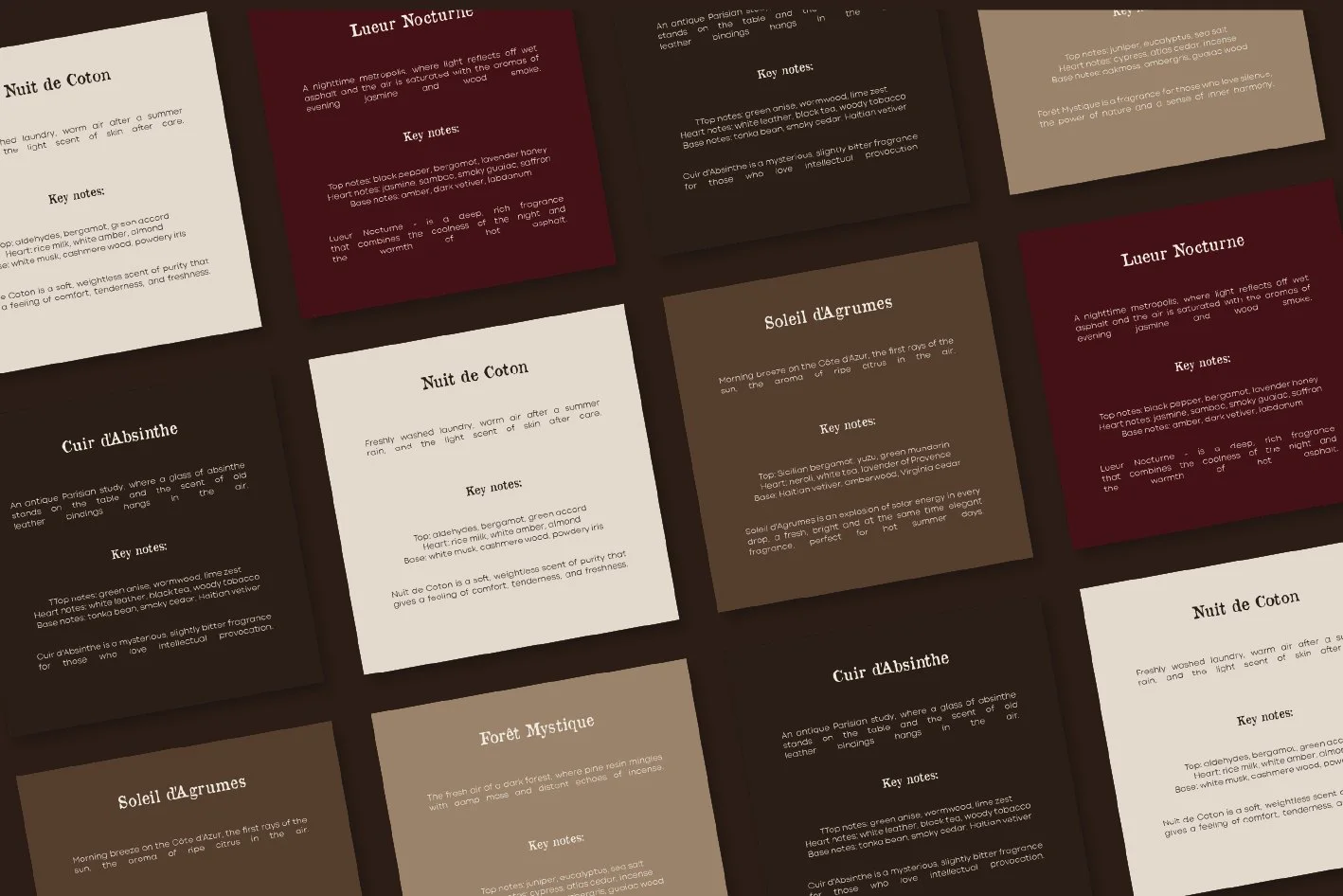
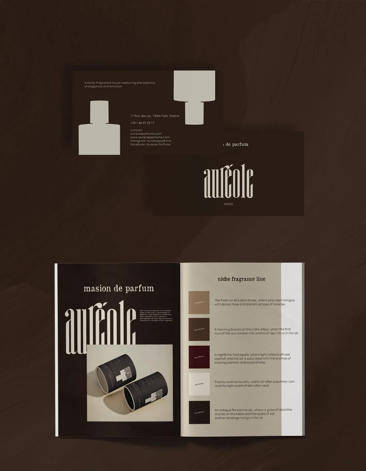
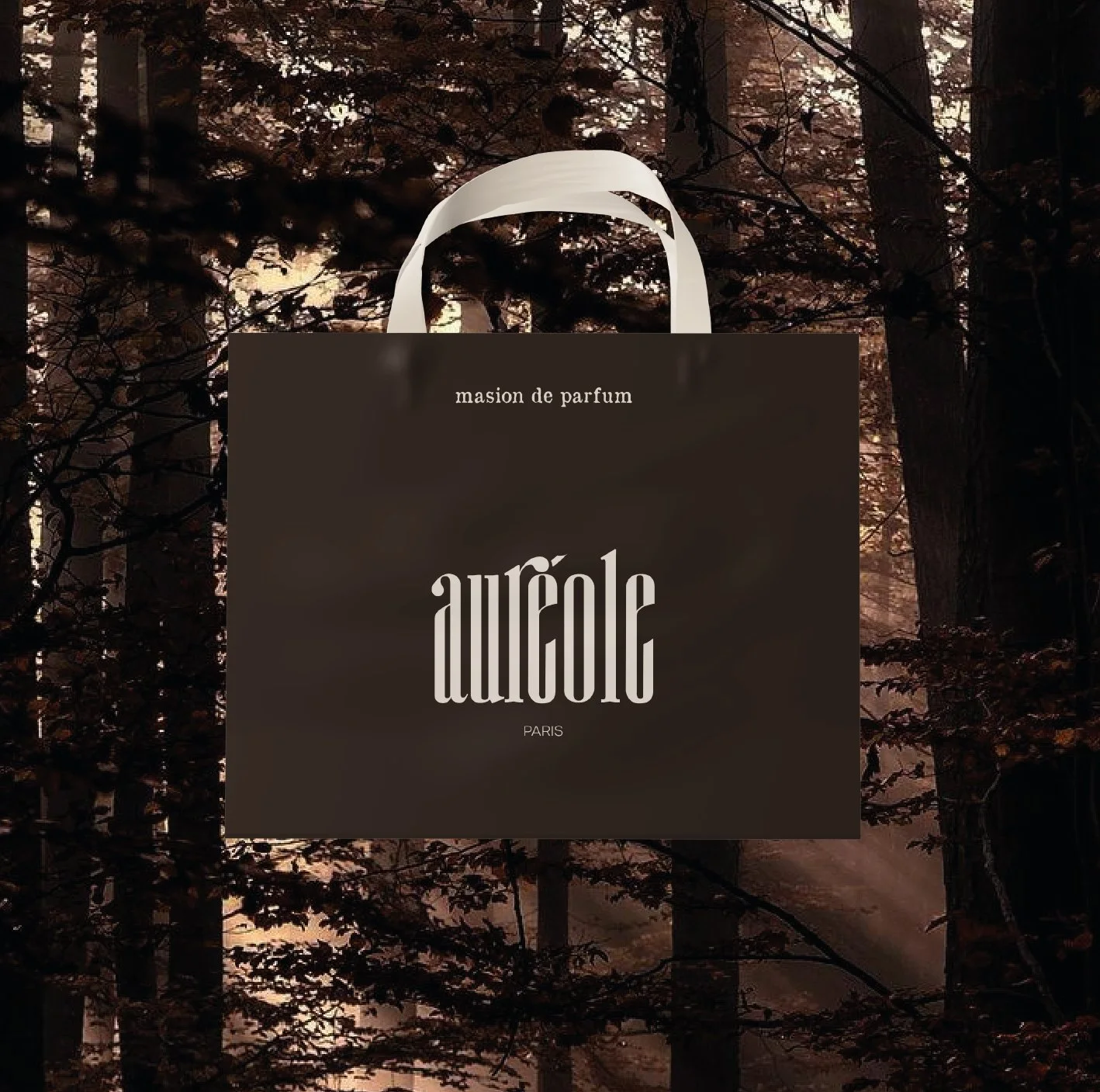
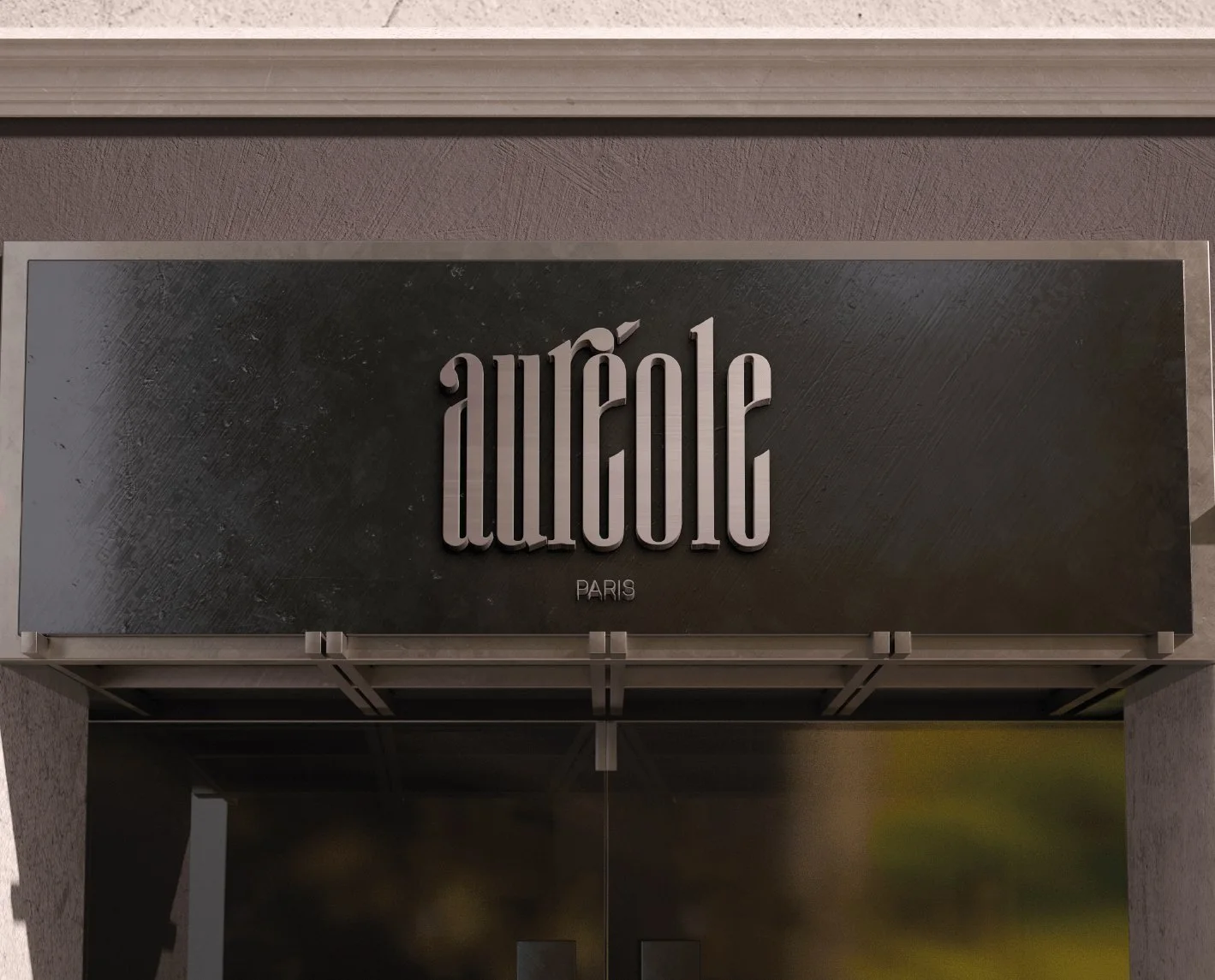
Sonya drew a tall, narrow wordmark with long vertical strokes and an accent over the é. Espresso, cream, taupe, leather and bordeaux dress the cards of the fragrances — Nuit de Coton, Lueur Nocturne, Cuir d’Absinthe, Soleil d’Agrumes and Forêt Mystique. The same system runs across the bottle labels, tubes, shopping bag, business cards, catalogue and the shop sign.
Five dark colours.
Espresso and cream do most of the work; taupe, leather and bordeaux dress the fragrance cards.
- Espresso#2C1D17
- Cream#E3D9CE
- Taupe#9A826A
- Leather#543D2E
- Bordeaux#421317
Discoverthe art offragrances.
The line from the packaging spread.
BRISCA

Let’s launch.
Send a short brief or a link to your current site. You’ll get a clear plan, timeline and quote — no sales call required.
- Reply within one business day
- Design, build and launch by one team
- One week of post-launch support included
Brief sent.
Thanks — we’ll read it and come back with a plan, a timeline and a quote.