
VARM
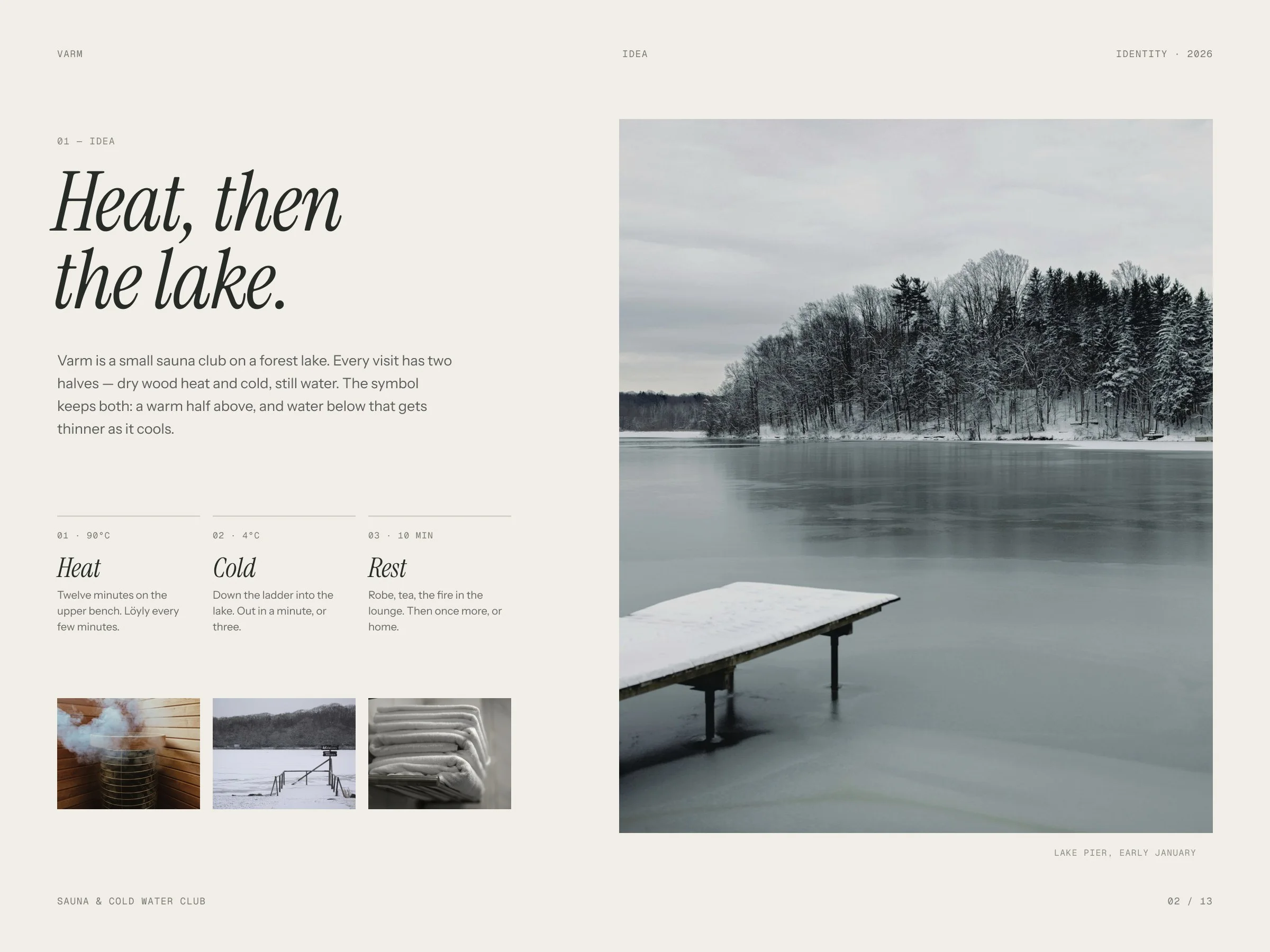
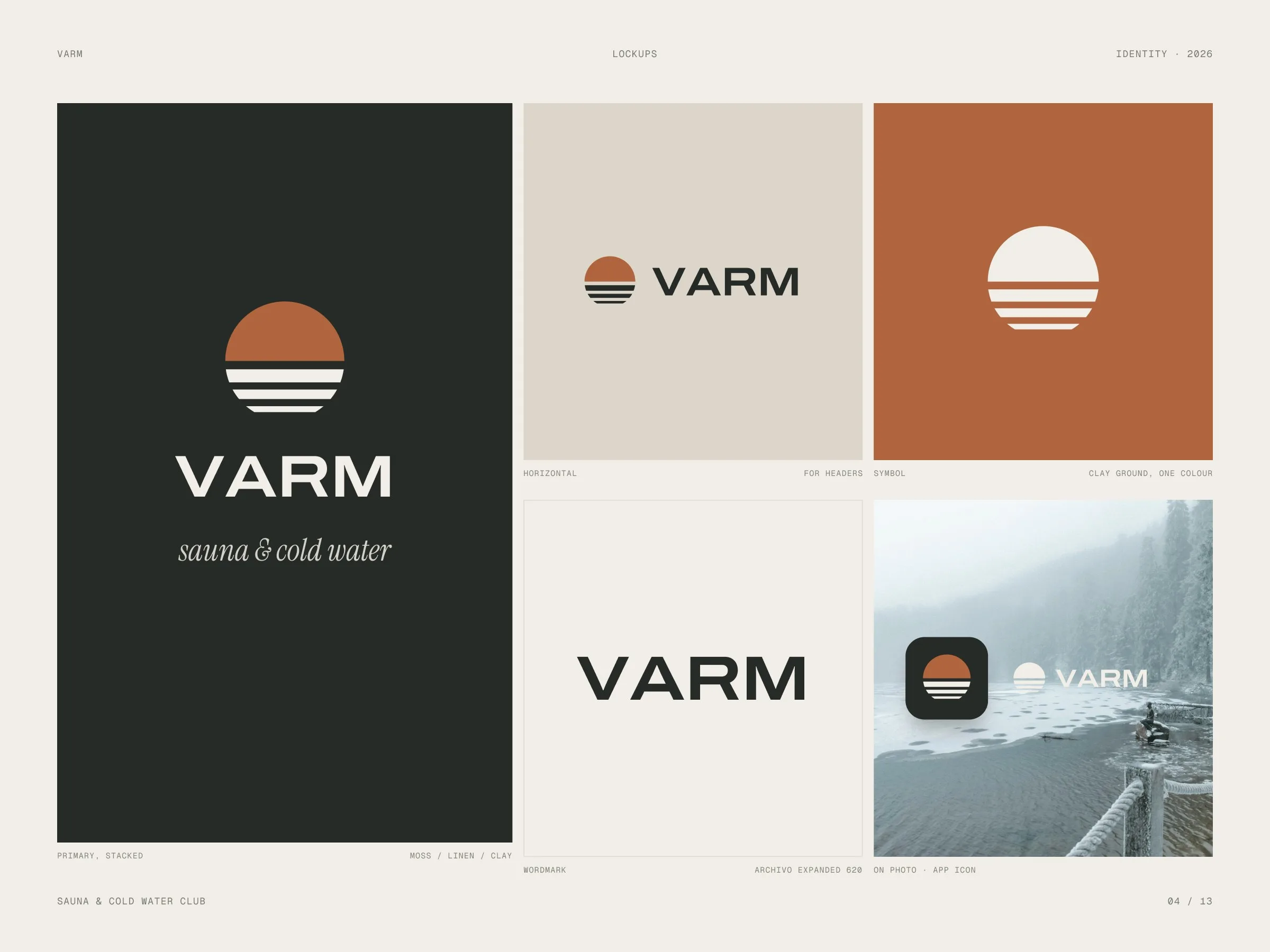
Identity concept for a lakeside sauna and cold-water club: a sun setting into water, a wide wordmark, five colours of a winter lake and a calm, short voice.
- Client
- VARM — studio concept
- Industry
- Sauna & cold-water club
- Scope
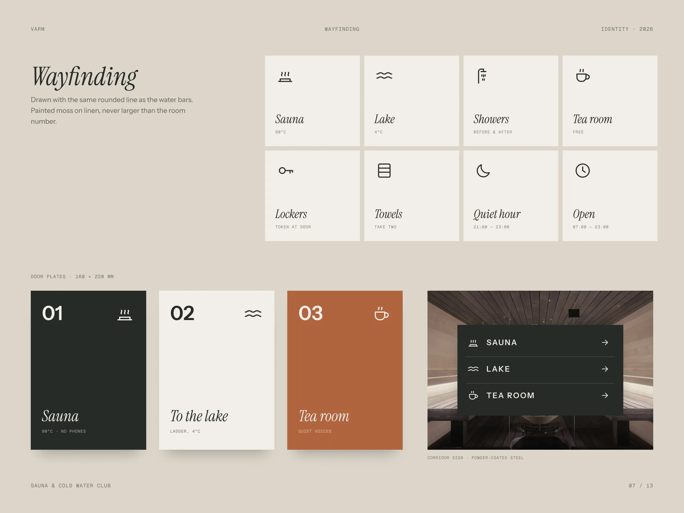
- Logo · Colour · Type · Print · Signage
- Format
- Identity system
- Year
- 2026
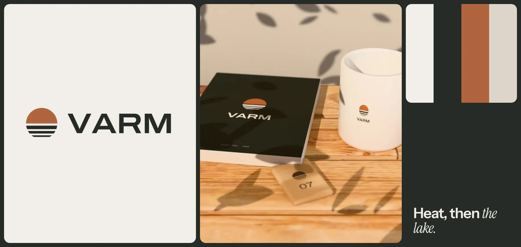
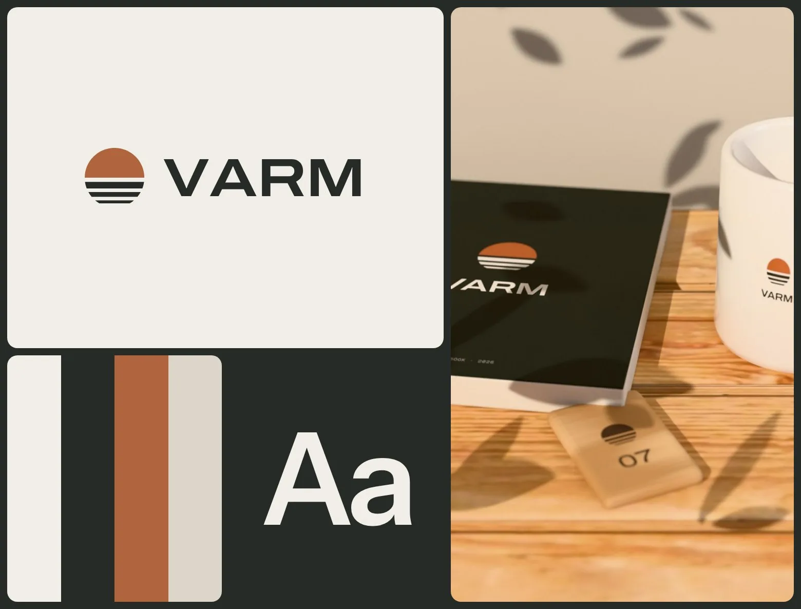
Heat, then the lake — an identity built on the two halves of every visit.
A self-initiated concept. Sauna clubs either look like spa hotels or like gyms. We wanted a brand that feels like the place itself: warm wood, cold water, very few words.
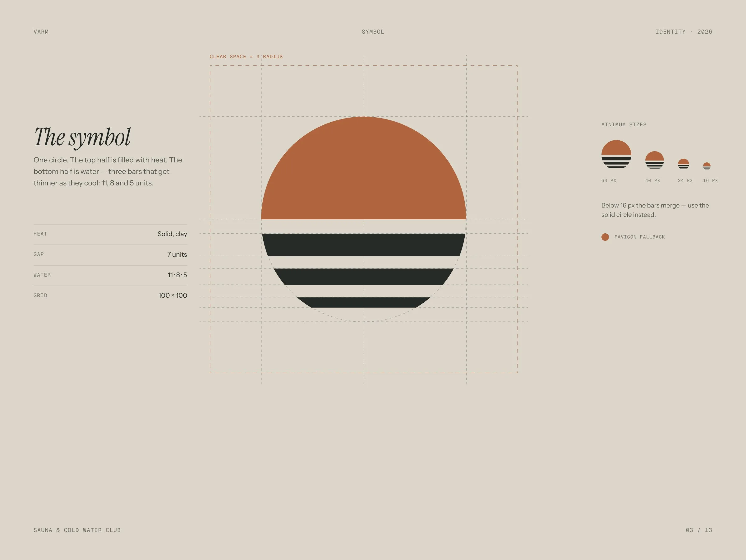
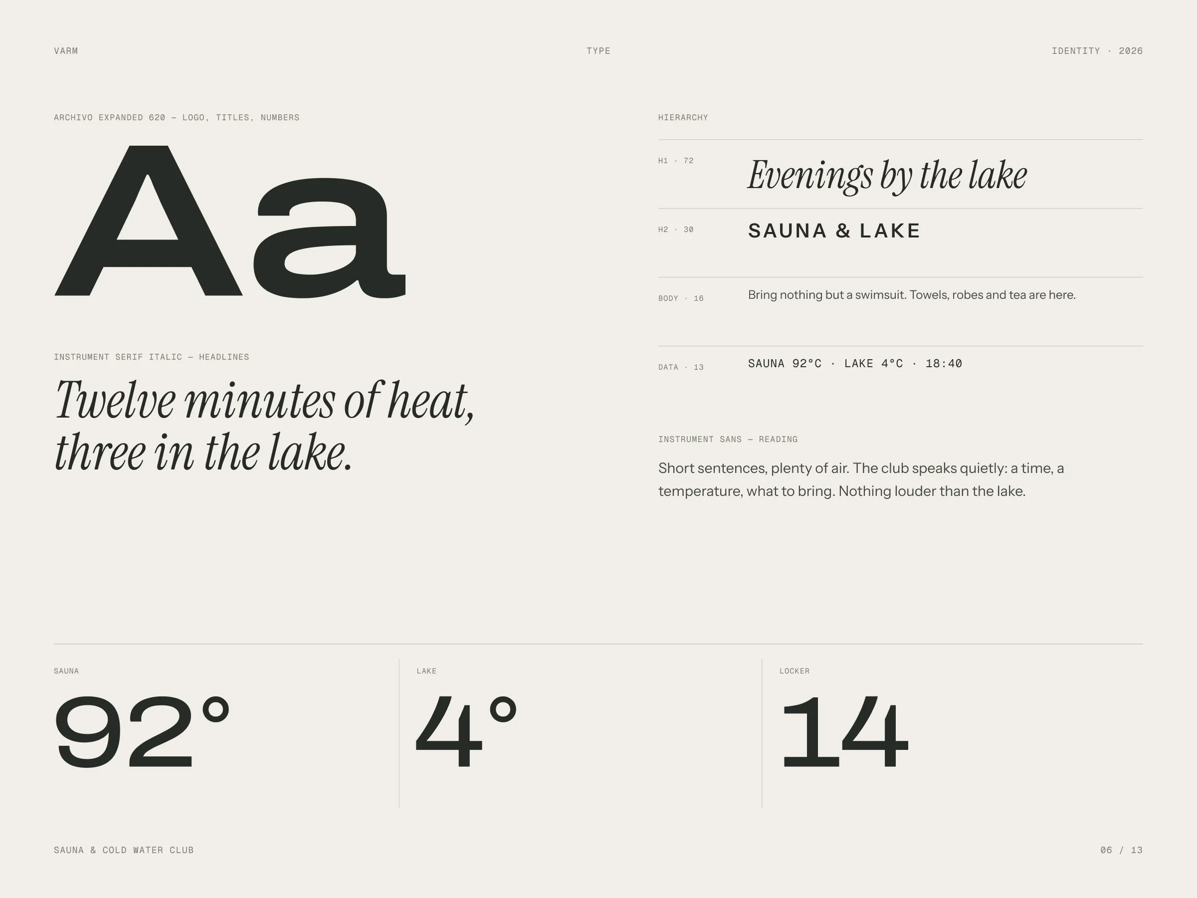
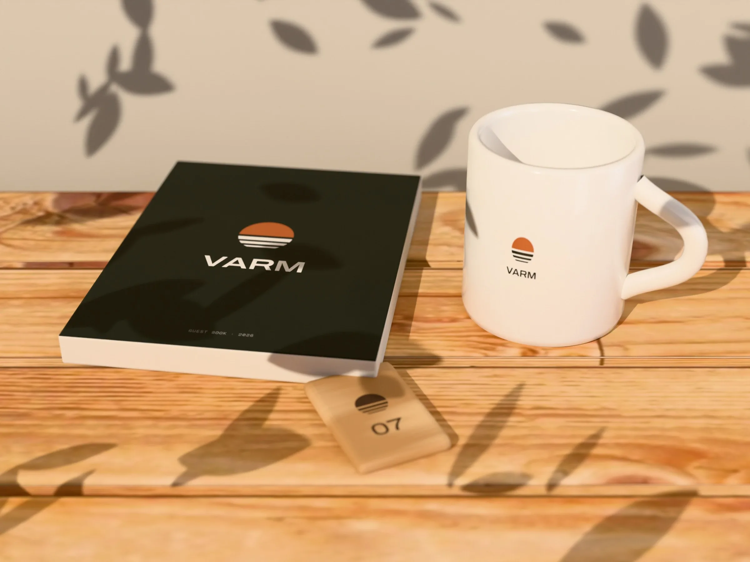
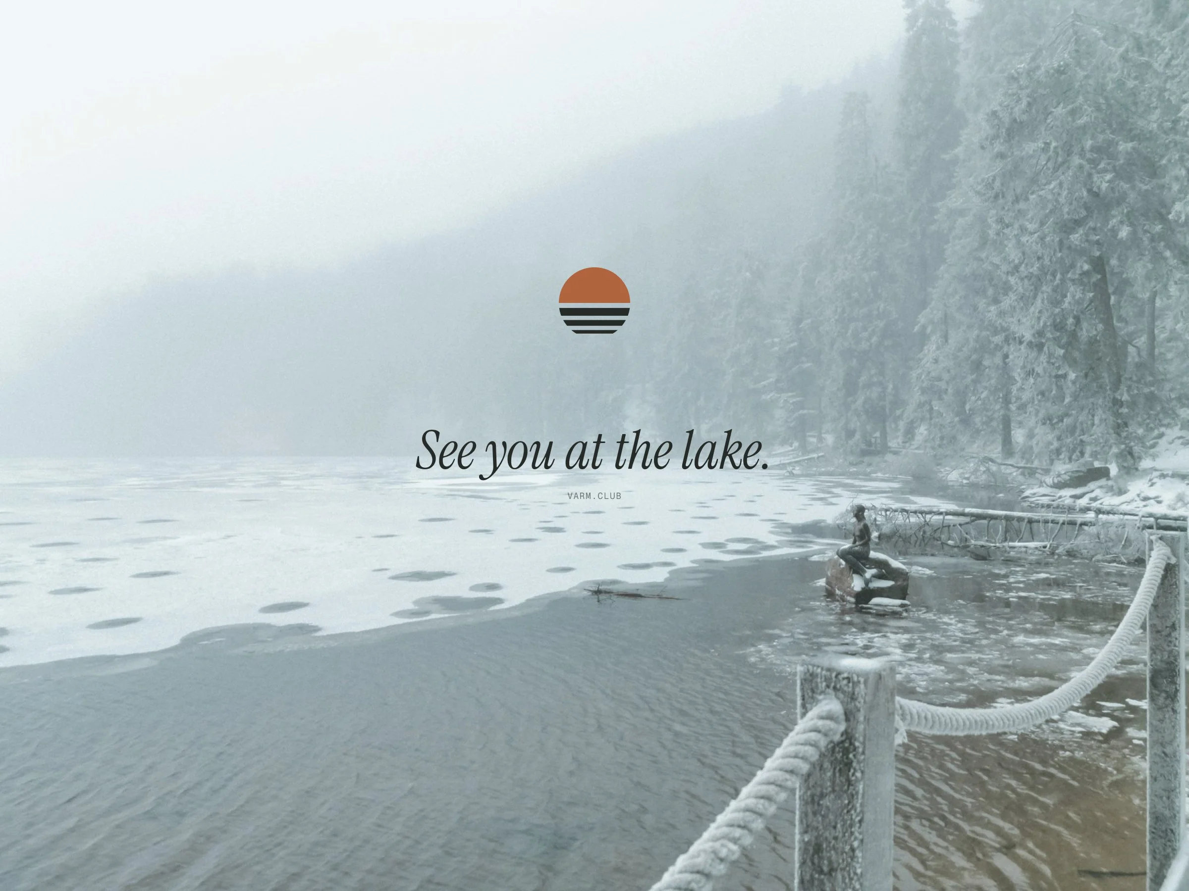
The symbol is a sun cut by three lines of water — heat above, the lake below. Around it: a wide grotesque wordmark, a serif italic for the quiet lines, five colours taken from linen, stone, moss and clay, and applications from cards and guest books to the door sign and a tote.
The identity in motion
Our own app made these loops from the identity’s own elements — its Layers and Collage templates, no After Effects.
Colours of a winter lake.
Linen and stone for paper, moss for night, clay for the heat.
- Linen#F1EEE7
- Stone#DCD6CA
- Smoke#8E938B
- Moss#262B27
- Clay#B1653F
On paper, wood and cotton.
01 — 03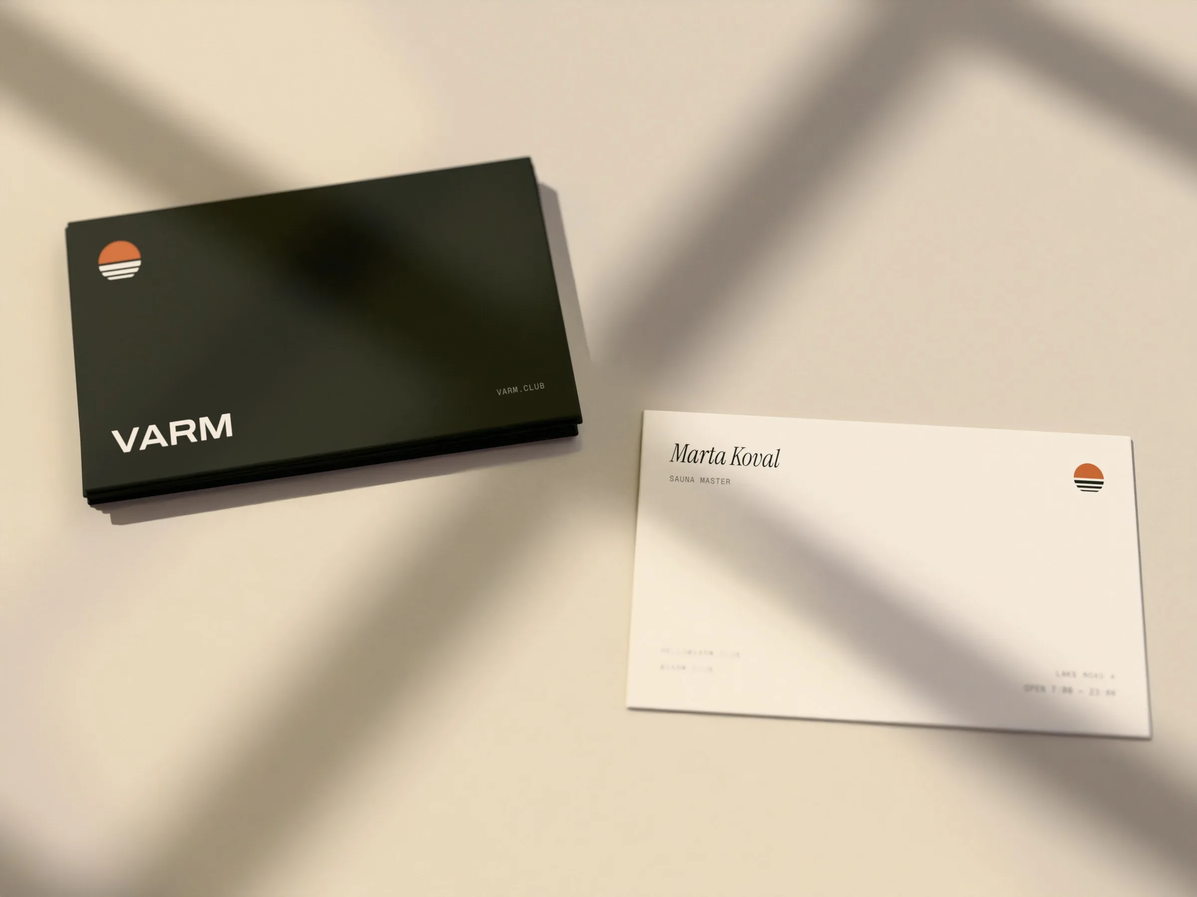
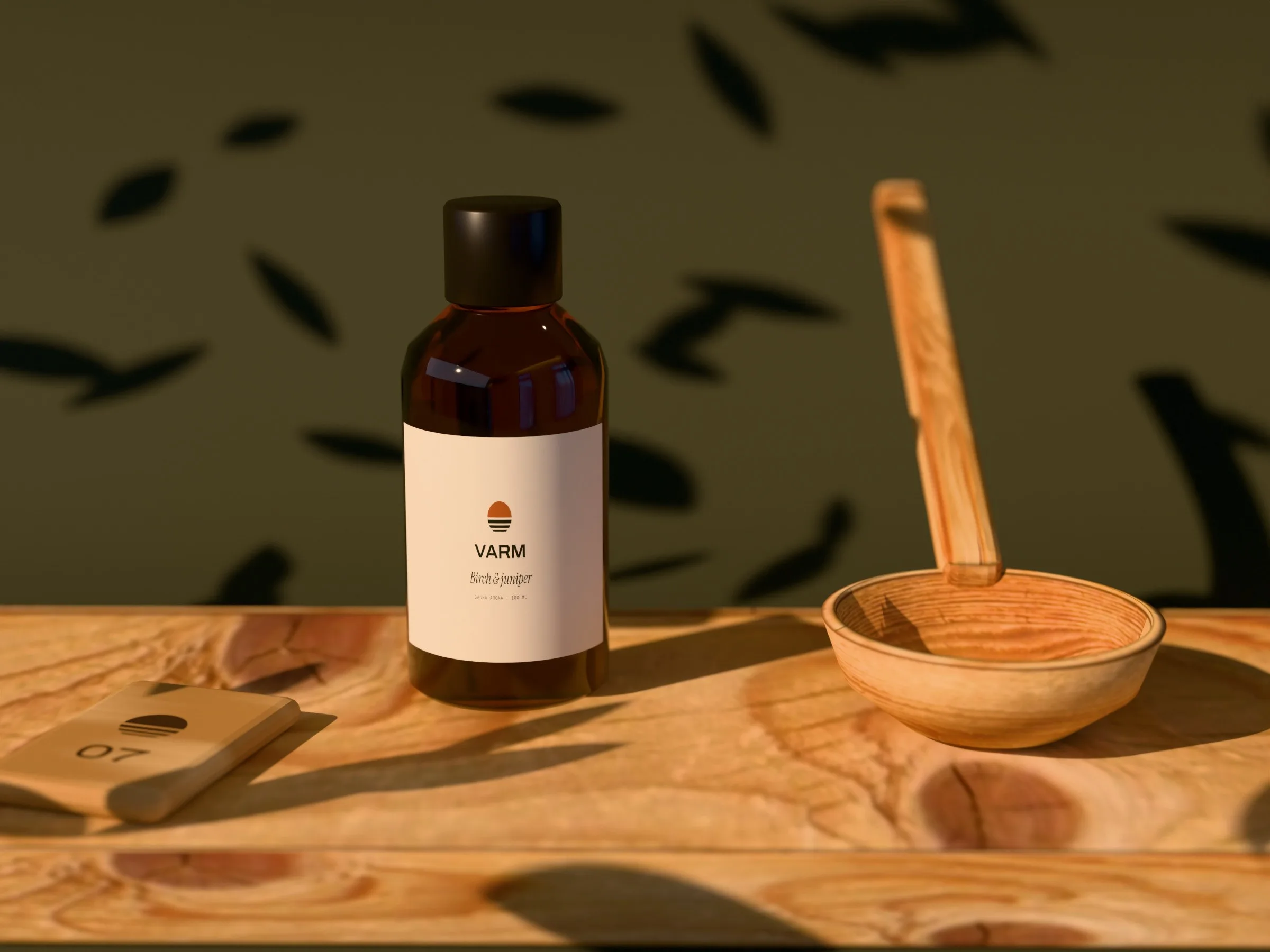
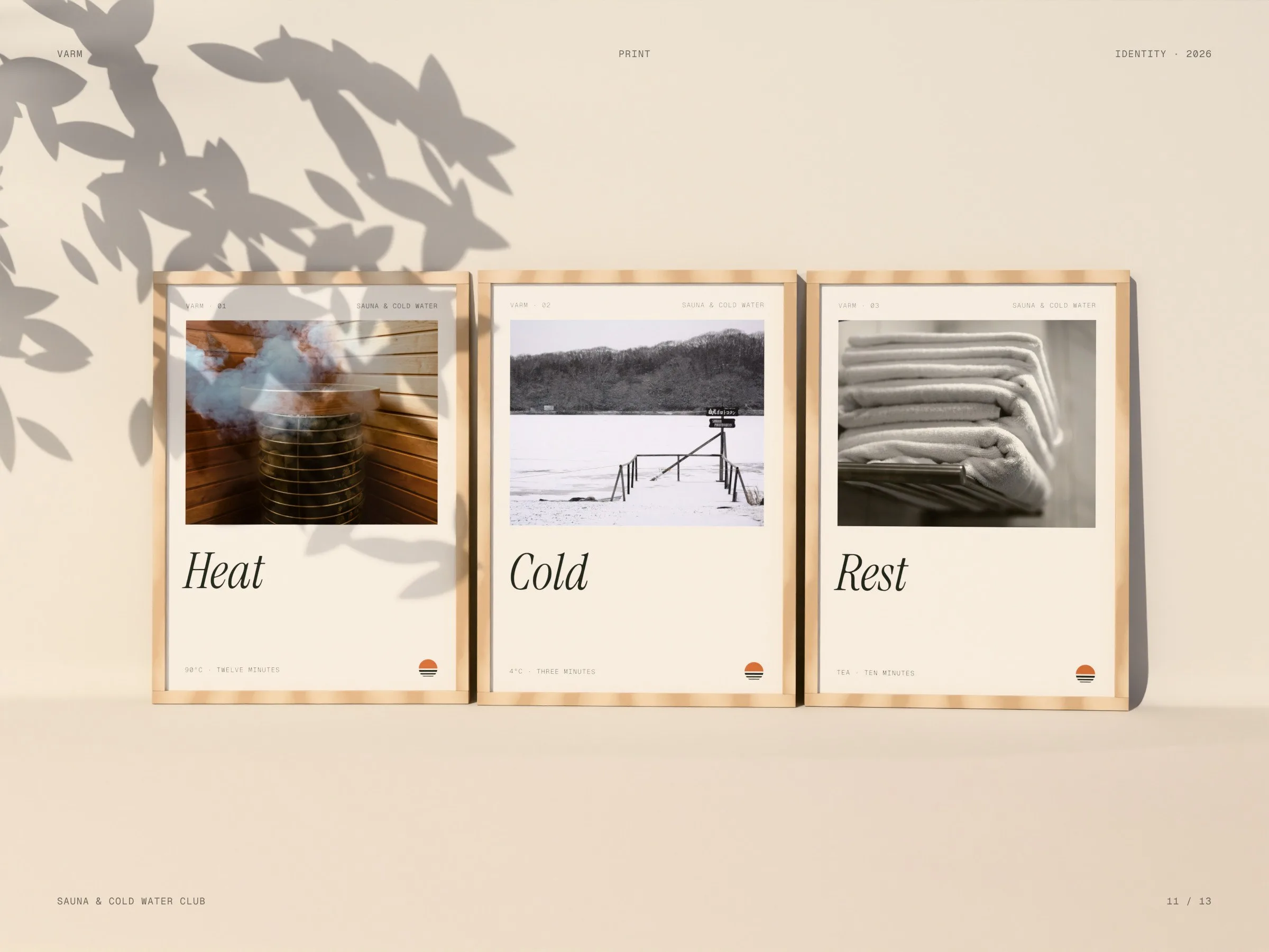
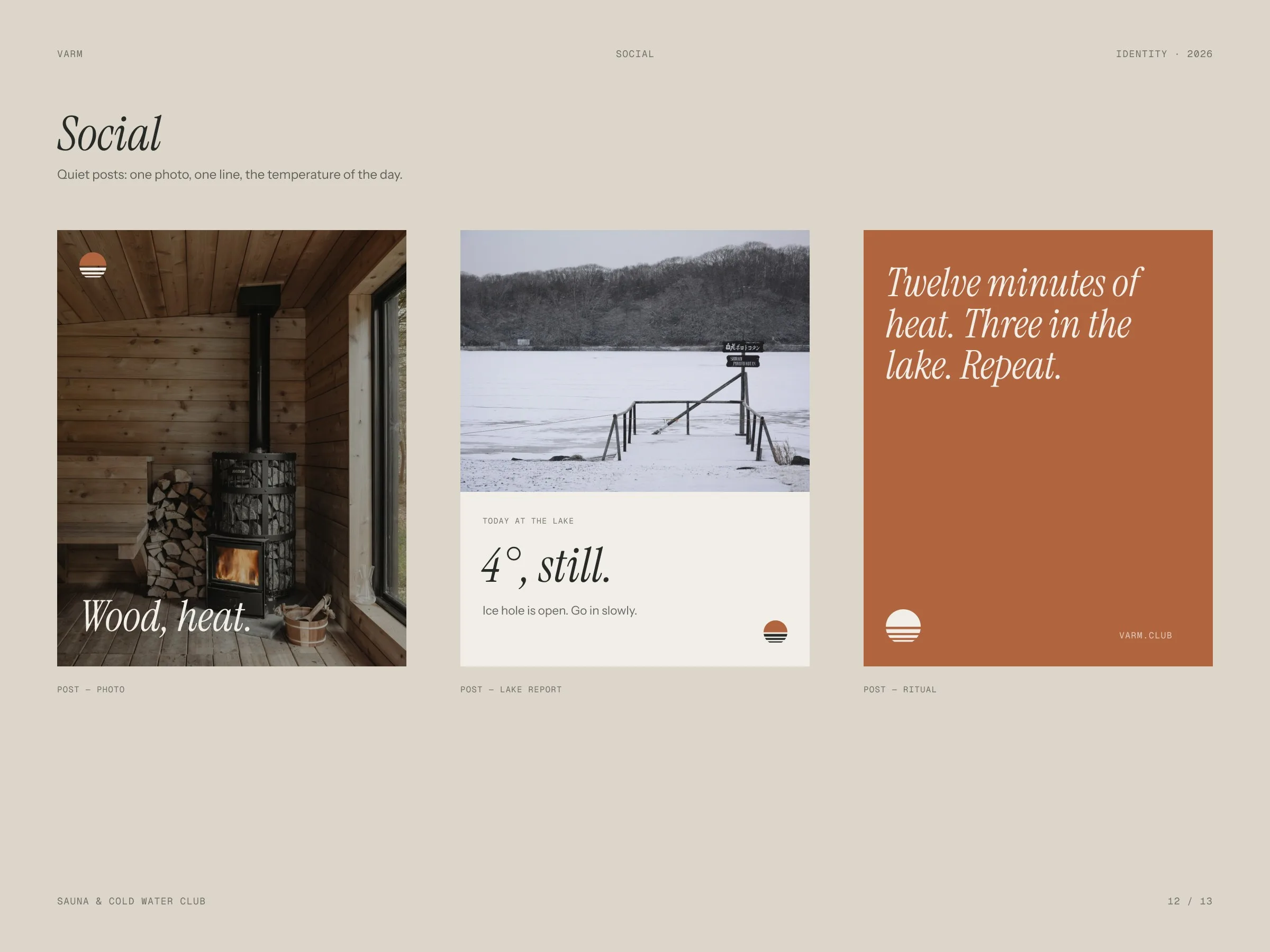
The lakeis 4°today.
Short lines in a serif italic, said the way a sauna master would say them.
Klyr

Let’s launch.
Send a short brief or a link to your current site. You’ll get a clear plan, timeline and quote — no sales call required.
- Reply within one business day
- Design, build and launch by one team
- One week of post-launch support included
Brief sent.
Thanks — we’ll read it and come back with a plan, a timeline and a quote.