
Ilma
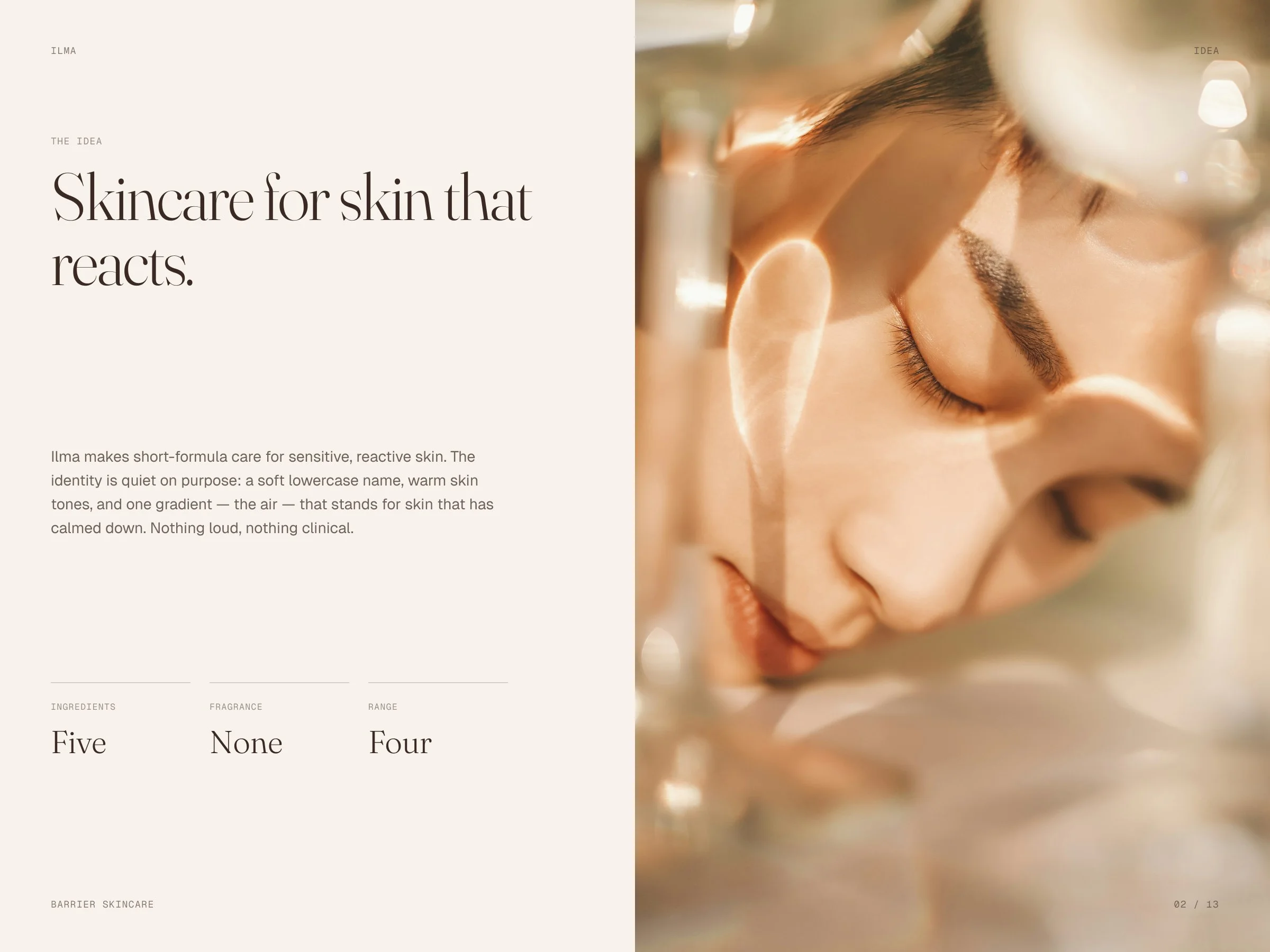
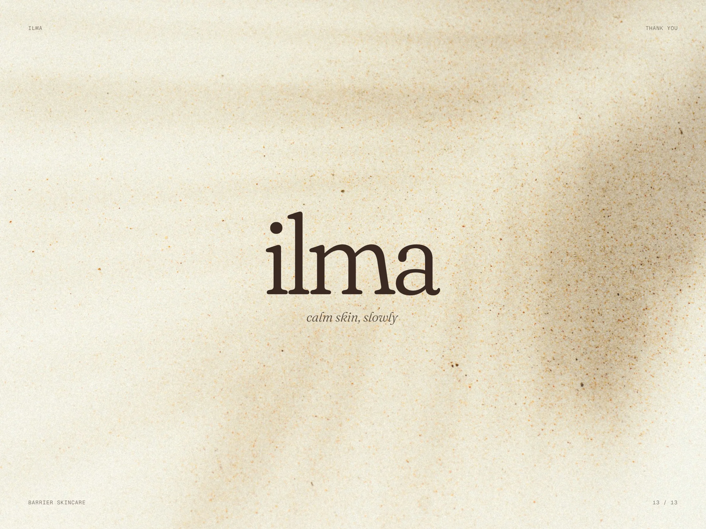
Identity concept for skincare made for sensitive, reactive skin: a soft lowercase name, warm skin tones and one gradient — the air.
- Client
- Ilma — studio concept
- Industry
- Skincare
- Scope
- Logo · Colour · Type · Packaging
- Format
- Identity system
- Year
- 2026
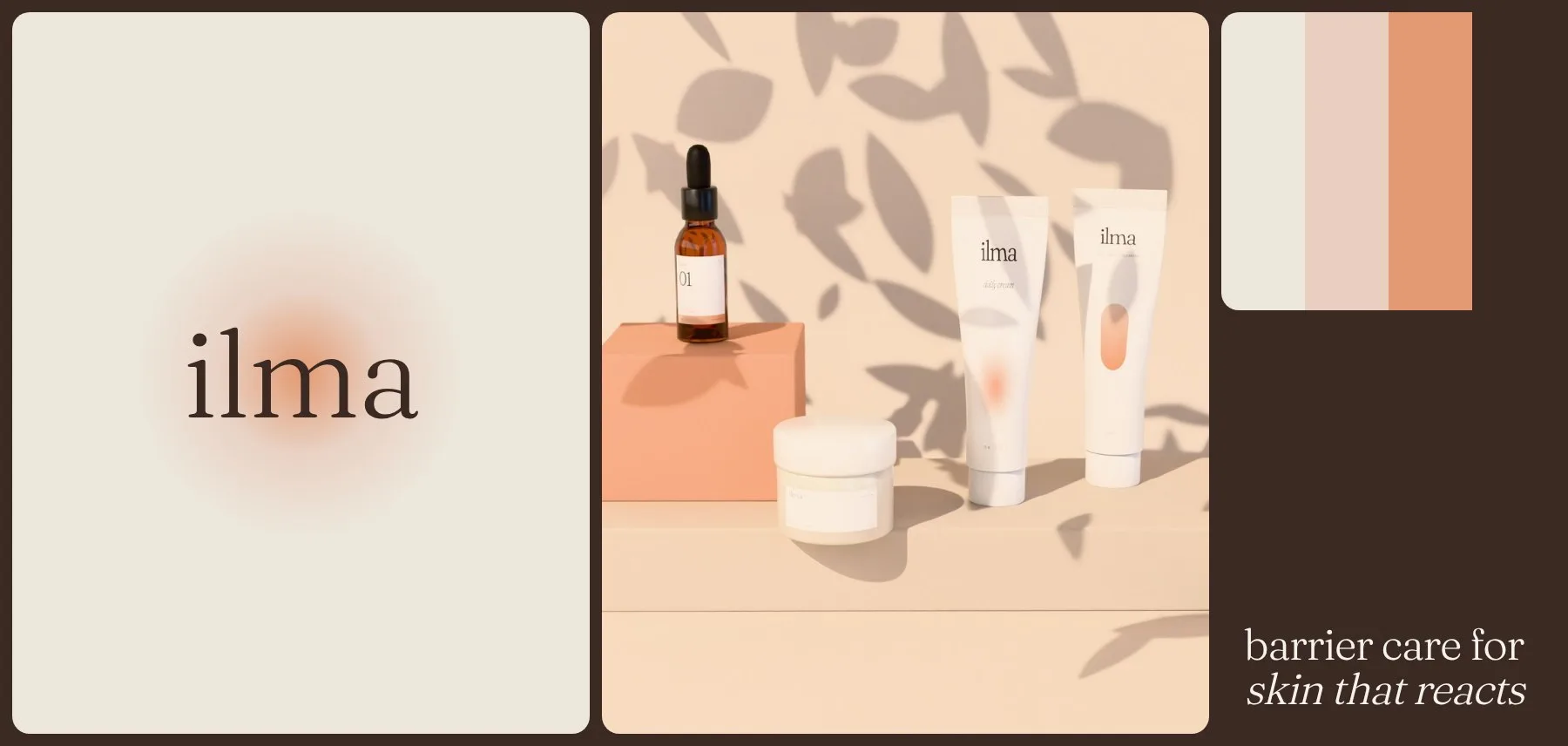
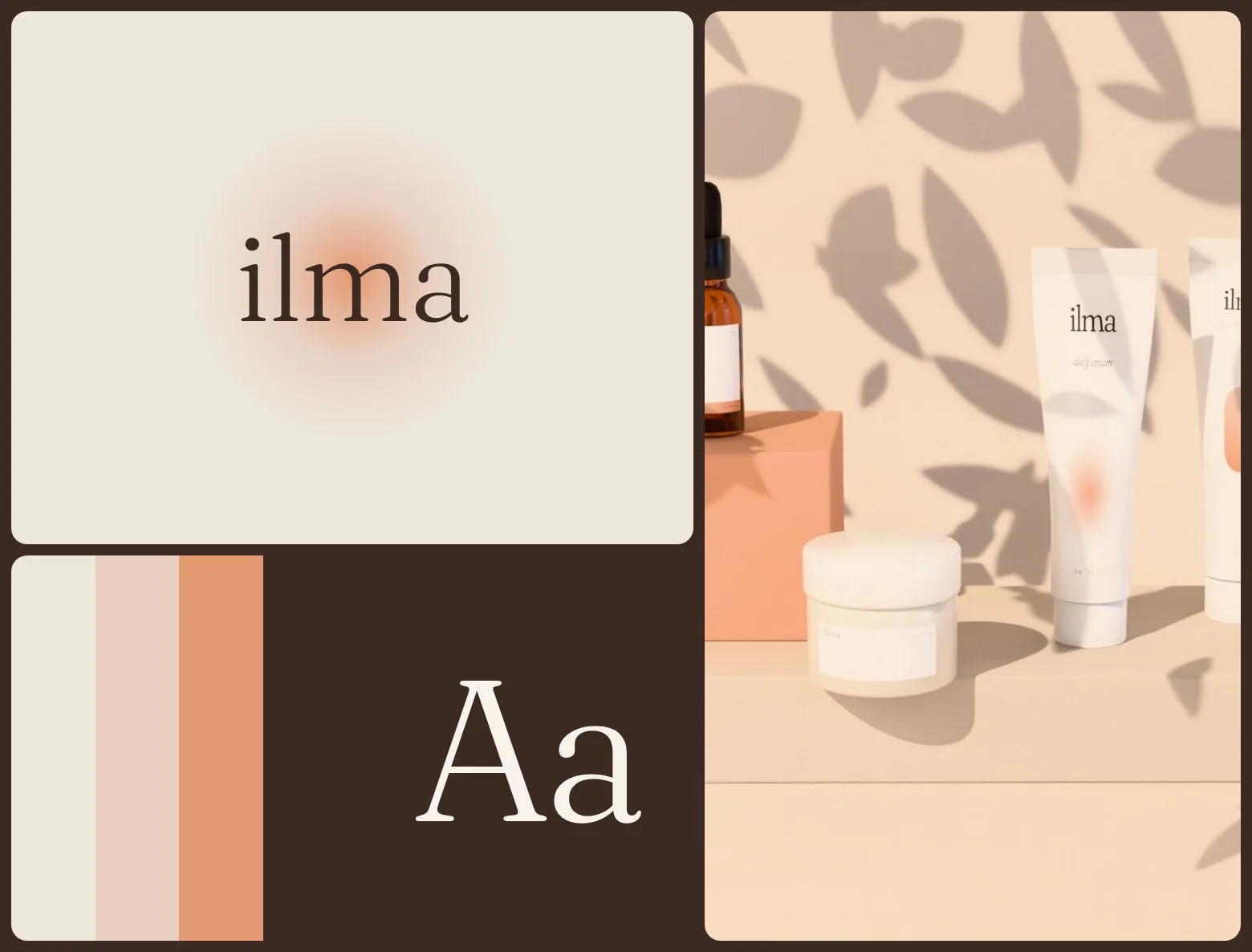
A quiet brand for skin that has had enough of loud products.
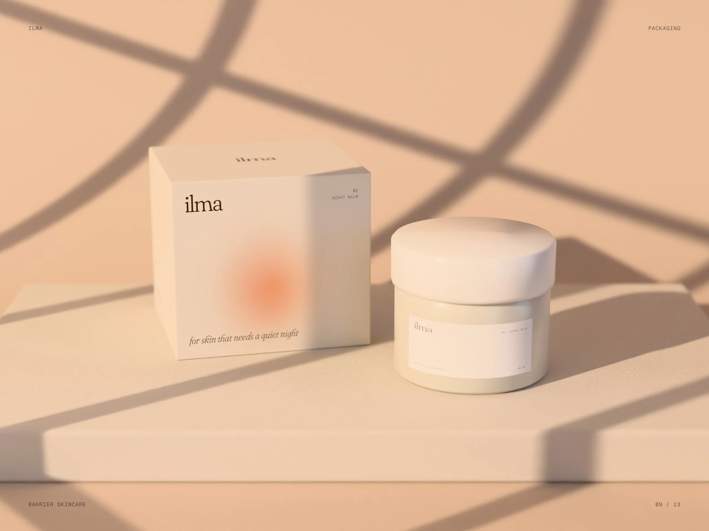
A self-initiated concept. Products for sensitive skin often look clinical: white, blue, lots of claims. We wanted something softer that feels like skin after it calms down.
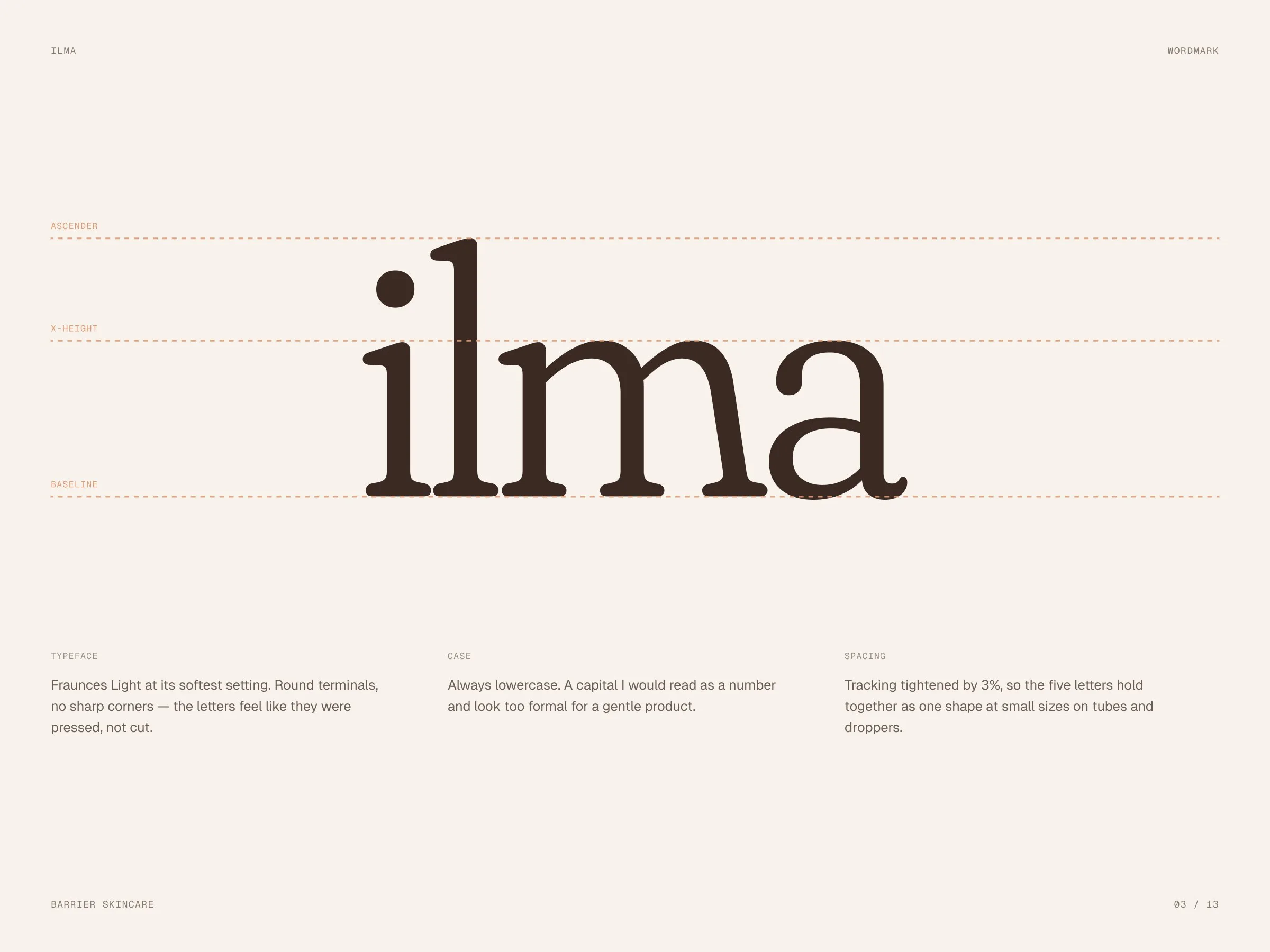
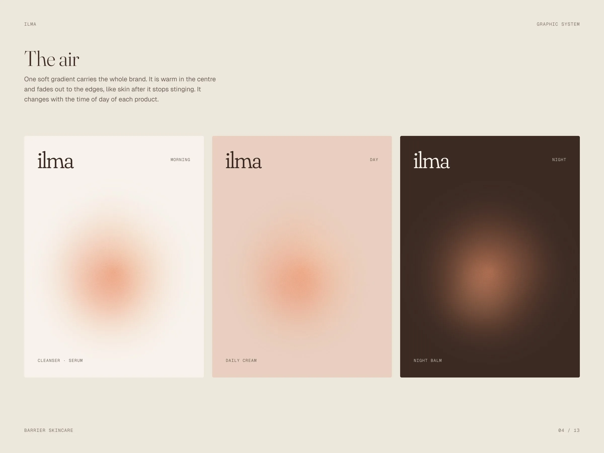
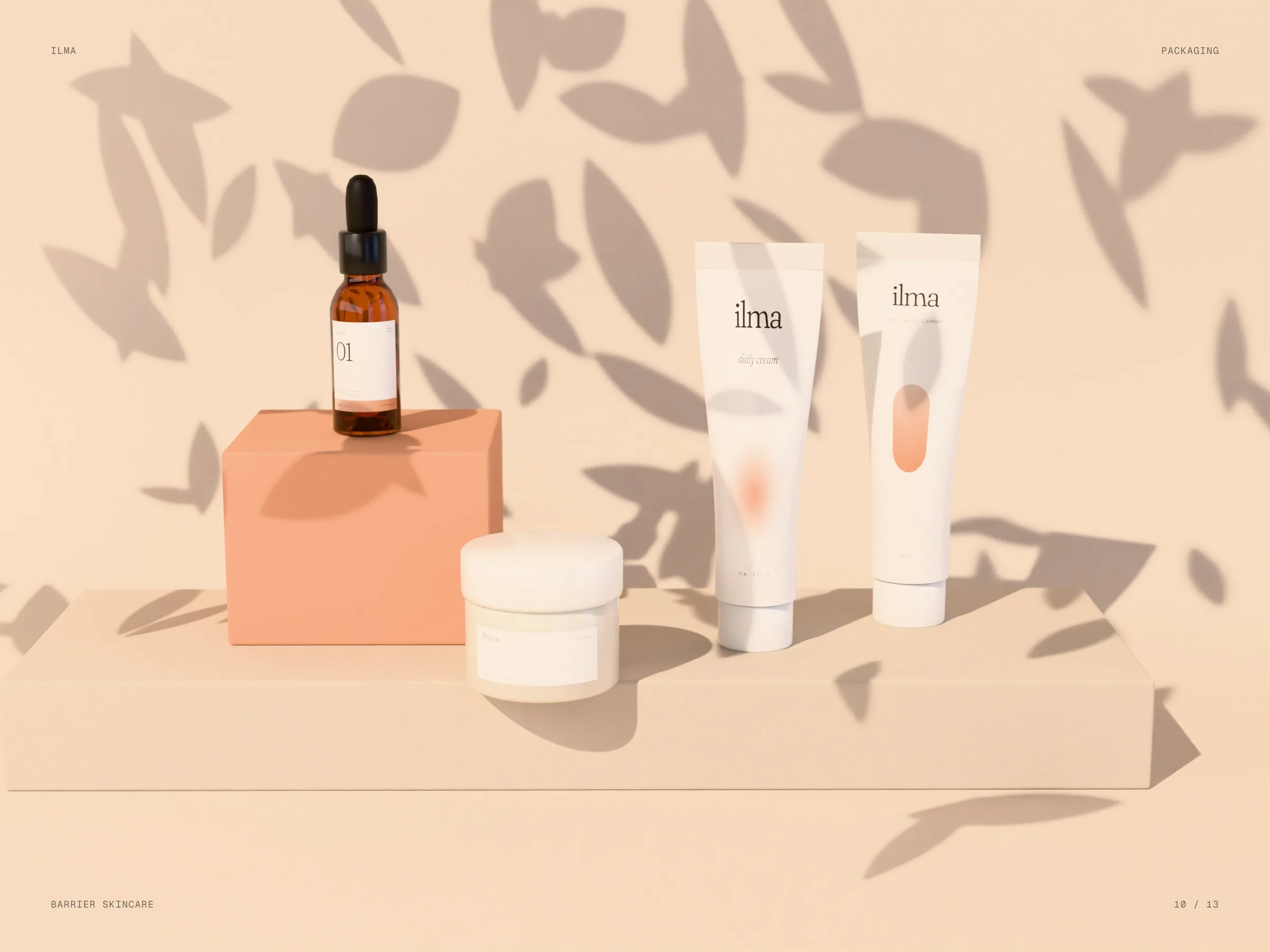
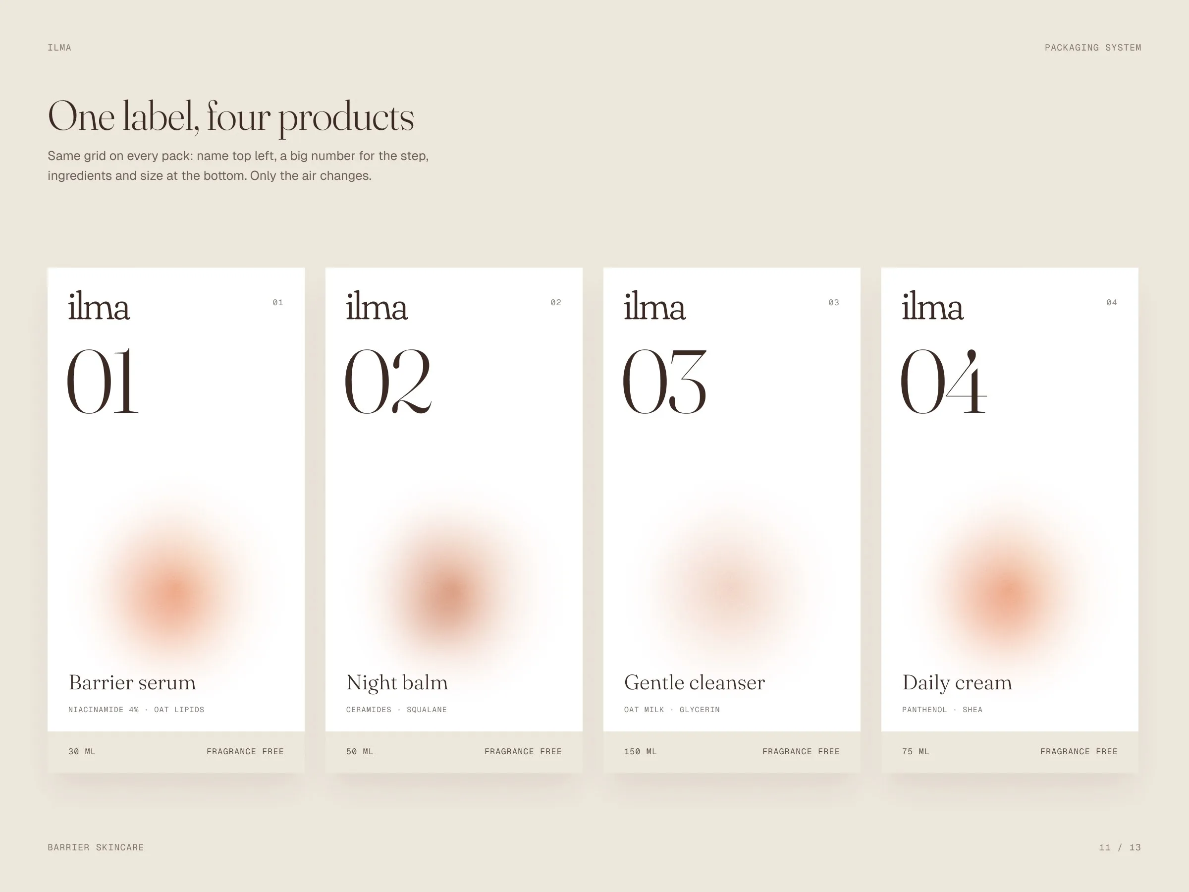
We set the name in a soft serif, always lowercase, and built the system around one gradient: warm in the centre, fading to the edges. It changes with the time of day of each product. One label grid carries the whole range — name, a big step number, ingredients and size.
The identity in motion
Our own app made these loops from the identity’s own elements — its Layers and Collage templates, no After Effects.
Warm skin tones.
Oat and milk for paper, blush and apricot for the air, cocoa for type and night.
- Oat#EDE6DB
- Milk#F7F3EC
- Blush#E8CFC0
- Apricot#E39A72
- Cocoa#3A2A23
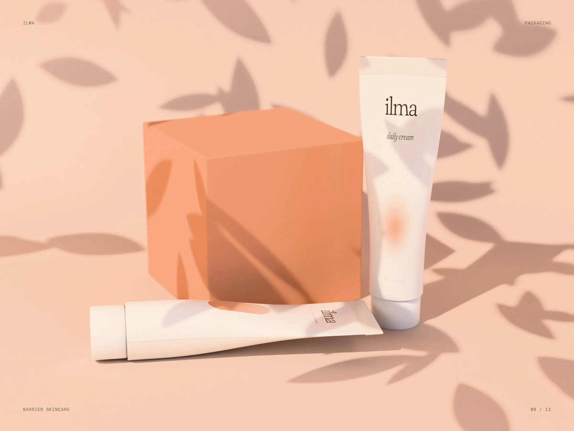
The range on the shelf.
01 — 04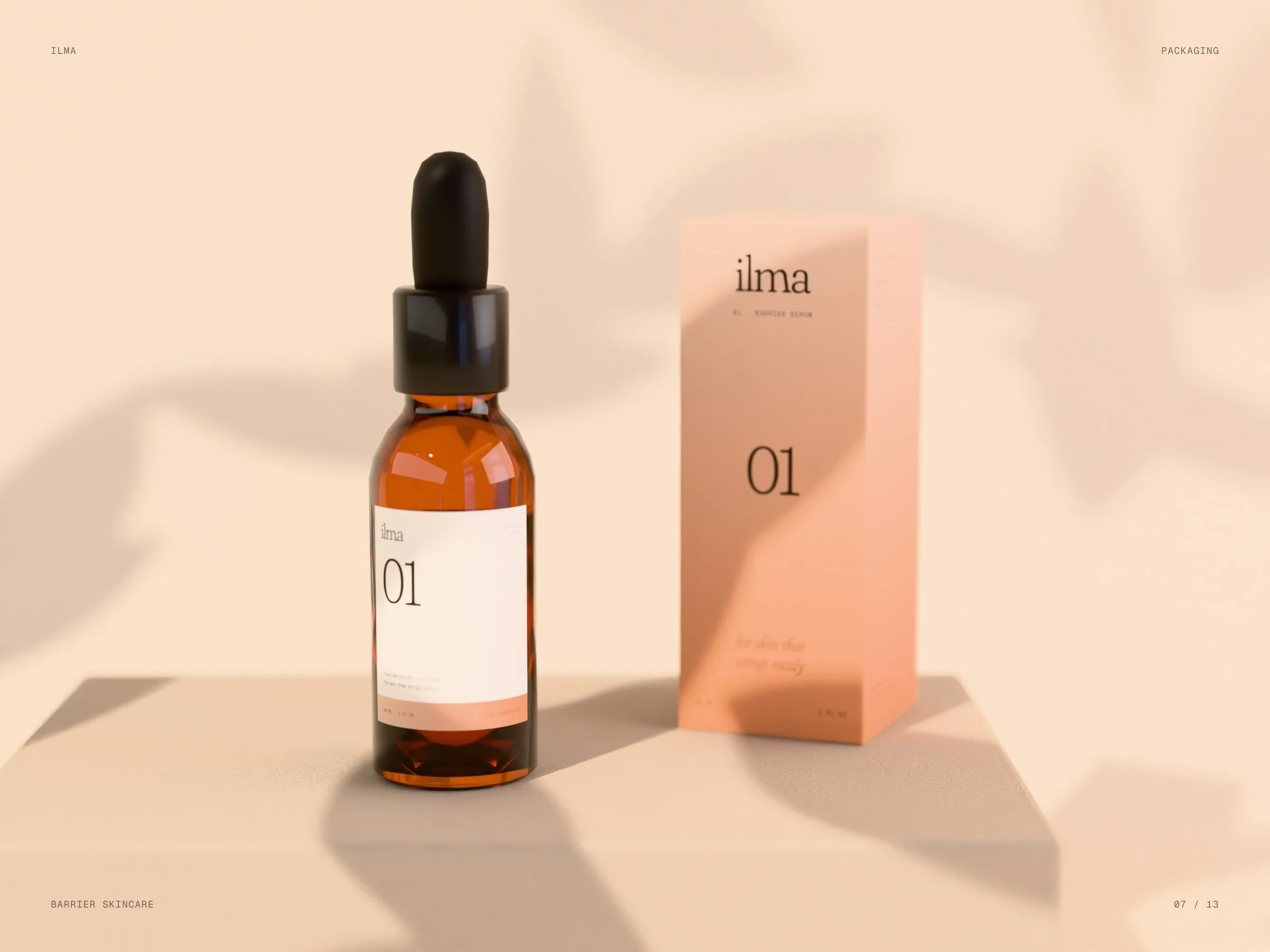
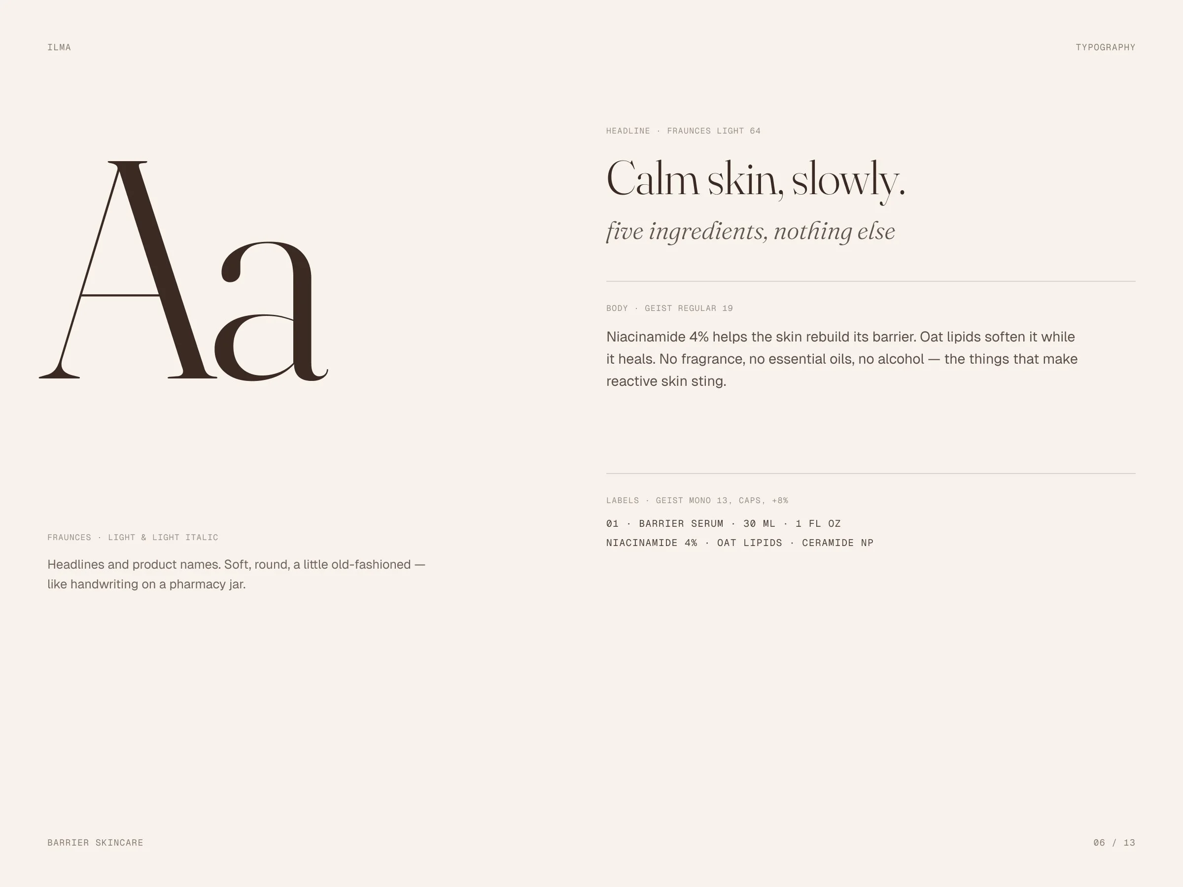
Calm skin,slowly.
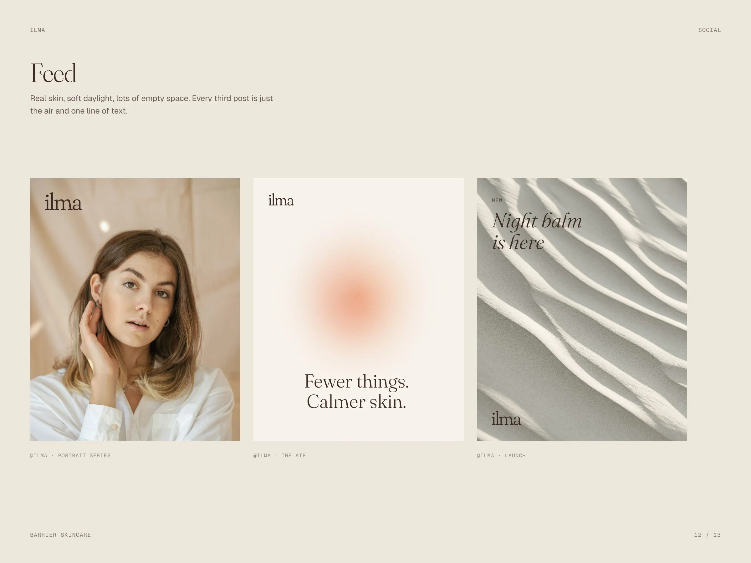
Few words, written softly.
NOYA
Let’s launch.
Send a short brief or a link to your current site. You’ll get a clear plan, timeline and quote — no sales call required.
- Reply within one business day
- Design, build and launch by one team
- One week of post-launch support included
Brief sent.
Thanks — we’ll read it and come back with a plan, a timeline and a quote.